Category: Forecasting

  • Time Series Forecasting with Python – Part IV – Stationarity and Augmented Dicky Fuller Test

    In Part III, we saw trends and seasonality in time series data and how can we decompose it using statsmodel.

    In this part we will learn about stationarity in time series data and how can we test it using Augmented Dicky Fuller Test.

    Stationarity is a fundamental concept in time series analysis. It refers to the statistical properties of a time series remaining constant over time. In a stationary time series, the mean, variance, and autocovariance structure do not change with time.

    There are three main components of stationarity:

    1. Constant Mean: The mean of the time series should remain constant over time. This means that the average value of the series does not show any trend or systematic patterns as time progresses.
    2. Constant Variance: The variance (or standard deviation) of the series should remain constant over time. It implies that the spread or dispersion of the data points around the mean should not change as time progresses.
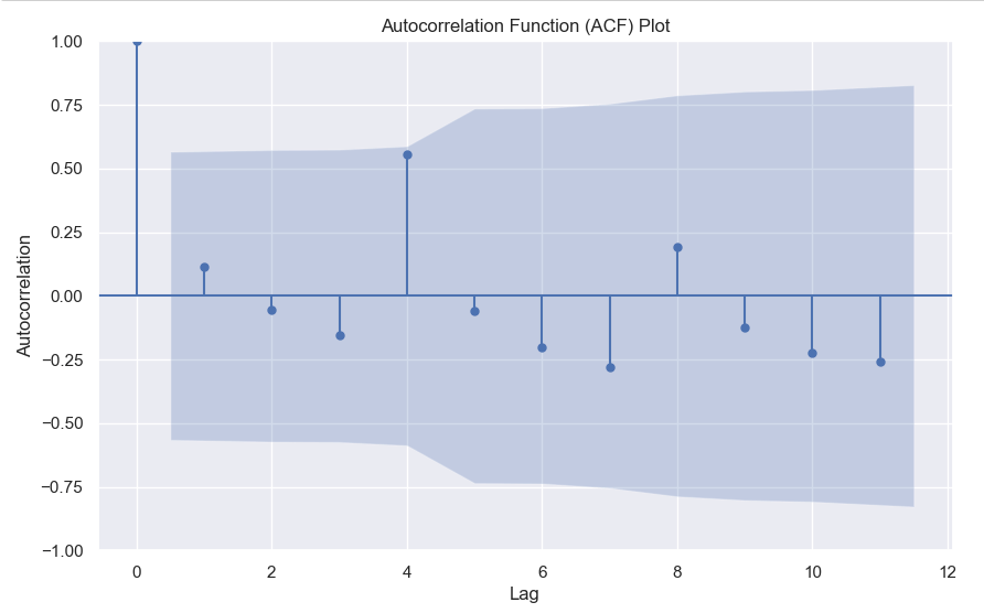
    3. Constant Autocovariance: The autocovariance between any two points in the time series should only depend on the time lag between them and not on the specific time at which they are observed. Autocovariance measures the linear relationship between a data point and its lagged values. In a stationary series, the autocovariance structure remains constant over time.

    Why is stationarity important in time series analysis? Stationarity is a crucial assumption for many time series models and statistical tests. If a time series violates the stationarity assumption, it can lead to unreliable and misleading results. For example, non-stationary series may exhibit trends, seasonality, or other time-dependent patterns that can distort statistical inference, prediction, and forecasting.

    To analyze non-stationary time series, researchers often use techniques like differencing to transform the series into a stationary form. Differencing involves computing the differences between consecutive observations to remove trends or other time-dependent patterns. Other methods, such as detrending or deseasonalizing, can also be employed depending on the specific characteristics of the series.

    It is important to note that while stationarity is desirable for many time series models, there are cases where non-stationary time series analysis is appropriate, such as when studying trending or seasonal data. However, in such cases, specialized models and techniques designed for non-stationary series need to be employed.

    Testing for Stationarity

    In Python, you can use various statistical tests to check for stationarity in a time series. One commonly used test is the Augmented Dickey-Fuller (ADF) test. The statsmodels library provides an implementation of the ADF test, which can be used to assess the stationarity of a time series.

    Here’s an example of how to perform the ADF test in Python:

    import pandas as pd
    from statsmodels.tsa.stattools import adfuller
    
    # Create a time series dataset
    data = [1, 2, 3, 4, 5, 6, 7, 8, 9, 10]
    
    # Perform the ADF test
    result = adfuller(data)
    
    # Extract the test statistic and p-value
    test_statistic = result[0]
    p_value = result[1]
    
    # Print the results
    print("ADF Test Statistic:", test_statistic)
    print("p-value:", p_value)
    

    The values come out to be

    ADF Test Statistic: 0.0
    p-value: 0.958532086060056

    The ADF test statistic measures the strength of the evidence against the null hypothesis of non-stationarity. A more negative (i.e., lower) test statistic indicates stronger evidence in favor of stationarity. The p-value represents the probability of observing the given test statistic if the null hypothesis of non-stationarity were true. A small p-value (typically less than 0.05) suggests rejecting the null hypothesis and concluding that the series is stationary. In this example we can clearly see that the null hypothesis was not rejected, meaning that the time series is not stationary.

    In the next part we will cover how we can convert non-stationary time series data to stationary time series.

  • Time Series Forecasting with Python Part 3 – Identifying Trends in Data

    While doing time series forecasting it is very important to analyse if your data has some trends, seasonality or periodicity in it. To identify if a time series has seasonality there are several techniques you can use.

    We will be using the following dummy data to see how we can test for seasonal trends in our data.

    sales = np.array([100, 120, 130, 150, 110, 130, 140, 160, 120, 140, 150, 170])
    
    quarters = ['Q1 2018', 'Q2 2018', 'Q3 2018', 'Q4 2018',
                'Q1 2019', 'Q2 2019', 'Q3 2019', 'Q4 2019',
                'Q1 2020', 'Q2 2020', 'Q3 2020', 'Q4 2020']
    
    1. Visual inspection – Just by looking at the plot of the time series, you can identify that there are visible patterns in it.

    In the image above you can clearly see that the sales grow from Q1 to Q3 and then decline in Q4 year on year.

    2. Autocorrelation Function (ACF) – Autocorrelation refers to the correlation of a series with itself at different time lags. In other words, it quantifies the similarity or relationship between a data point and its preceding or lagged observations. The ACF helps identify any repeating patterns or dependencies within the time series data.

    In the ACF plot, if we see spikes at regular lag intervals, it indicates seasonality. We can take the help of plot_acf from the statsmodels package.

    import numpy as np
    import pandas as pd
    import matplotlib.pyplot as plt
    import statsmodels.api as sm
    from statsmodels.graphics.tsaplots import plot_acf
    
    # Generate ACF plot
    fig, ax = plt.subplots(figsize=(10, 6))
    plot_acf(sales, lags=11, ax=ax)  # Set lags to the number of quarters (12) minus 1
    
    plt.title('Autocorrelation Function (ACF) Plot')
    plt.xlabel('Lag')
    plt.ylabel('Autocorrelation')
    plt.show()
    

    Here we can clearly see a spike at 4, indicating what we already know that there is a seasonality present within the time series data.

    3. Decomposition –

    Decomposition is a technique used to break down a time series into its individual components: trend, seasonality, and residual (also known as error or noise). The decomposition process allows us to isolate and analyze these components separately, providing insights into the underlying patterns and variations within the time series data.

    There are two commonly used types of decomposition:

    1. Additive
    2. Multiplicative.
    1. Additive Decomposition: In additive decomposition, the time series is assumed to be the sum of its components. It is expressed as:Y(t) = Trend(t) + Seasonality(t) + Residual(t)
      The additive decomposition assumes that the magnitude of the seasonal fluctuations remains constant throughout the time series.
    2. Multiplicative Decomposition: In multiplicative decomposition, the time series is assumed to be the product of its components. It is expressed as:Y(t) = Trend(t) * Seasonality(t) * Residual(t)
      Multiplicative decomposition assumes that the seasonal fluctuations grow or shrink proportionally with the trend.

    Again we will be using the statsmodels package to perform seasonal decomposition.

    from statsmodels.tsa.seasonal import seasonal_decompose
    
    # Create a pandas Series with a quarterly frequency
    index = pd.date_range(start='2018-01-01', periods=len(sales), freq='Q')
    series = pd.Series(sales, index=index)
    
    # Perform seasonal decomposition
    decomposition = seasonal_decompose(series, model='additive')
    
    # Extract the components
    trend = decomposition.trend
    seasonality = decomposition.seasonal
    residuals = decomposition.resid
    
    # Plot the components
    plt.figure(figsize=(10, 8))
    plt.subplot(411)
    plt.plot(series, label='Original')
    plt.legend(loc='best')
    plt.subplot(412)
    plt.plot(trend, label='Trend')
    plt.legend(loc='best')
    plt.subplot(413)
    plt.plot(seasonality, label='Seasonality')
    plt.legend(loc='best')
    plt.subplot(414)
    plt.plot(residuals, label='Residuals')
    plt.legend(loc='best')
    plt.tight_layout()
    plt.show()
    

    In this dummy example, we can clearly see via this decomposition that there is an upwards trend in the data along with a quarterly seasonality.

    There are a couple more tests left to explore, but we will pick those up in the next part where we will continue to explore this seasonality and trends in time series data.

  • Time Series Forecasting with Python – Part 2 (Moving Averages)

    In Part 1 of this series, we covered how you can use lag features and simple linear regression models to do time series forecasting, but that is very simple and you cannot capture trends using that model which is non-linear.

    So we will be discussing different types of moving averages you can calculate in python and how they are helpful.

    Simple Moving Average

    # Loading Libraries
    import numpy as np
    import pandas as pd
    import seaborn as sns
    
    sns.set_theme()
    #Using the available dowjones data in seaborn
    dowjones = sns.load_dataset("dowjones")
    dowjones.head()
    

    sns.lineplot(data=dowjones, x="Date", y="Price")

    A simple moving average (SMA) calculates the average of a selected range of values, by the number of periods in that range. The most typical moving averages are 30-day, 50-day, 100-day and 365 day moving averages. Moving averages are nice cause they can determine trends while ignoring short-term fluctuations. One can calculate the sma by simply using

    DataFrame.rolling(window, min_periods=None, center=False, win_type=None, on=None, axis=0, closed=None, step=None, method='single')

    dowjones['sma_30'] = dowjones['Price'].rolling(window=30, min_periods=1).mean()
    dowjones['sma_50'] = dowjones['Price'].rolling(window=50, min_periods=1).mean()
    dowjones['sma_100'] = dowjones['Price'].rolling(window=100, min_periods=1).mean()
    dowjones['sma_365'] = dowjones['Price'].rolling(window=365, min_periods=1).mean()
    
    sns.lineplot(x="Date", y="value", legend='auto', hue = 'variable', data = dowjones.melt('Date'))
    

    As you can see the higher the value of the window, the lesser it is affected by short-term fluctuations and it captures long-term trends in the data. Simple Moving Averages are often used by traders in the stock market for technical analysis.

    Exponential Moving Average

    Simple moving averages are nice, but they give equal weightage to each of the data points, what if you wanted an average that will give higher weight to more recent points and lesser to points in the past. In that case, what you want is to compute the exponential moving average (EMA).

    $latex EMA_{Today} = Value_{Today}(\frac{smoothing}{1+Days}) + EMA_{Yesterday}(1 – \frac{Smoothing}{1+Days})$

    To calculate this in pandas you just have to use the pandas ewm function.

    dowjones['ema_50'] = dowjones['Price'].ewm(span=50, adjust=False).mean()
    dowjones['ema_100'] = dowjones['Price'].ewm(span=100, adjust=False).mean()
    
    sns.lineplot(x="Date", y="value", legend='auto', hue = 'variable', 
                 data = dowjones[['Date', 'Price','ema_50', 'sma_50']].melt('Date'))
    

    As you can see the ema_50 follows the Price chart more closely than the sma_50 and is more sensitive to the recent data points.

    Which moving average you should use as a feature of your forecasting model is a question mostly dependent on the use case. However, you will often use some kind of moving average as a feature or to visualise long-term or short-term trends in your data.

    In Part 3 we explore trends and seasonality and how can you identify them in your data.

  • Time Series Forecasting with Python – Part 1 (Simple Linear Regression)

    In this series of posts, I’ll be covering how to approach time series forecasting in python in detail. We will start with the basics and build on top of it. All posts will contain a practice example attached as a GitHub Gist. You can either read the post or watch the explainer Youtube video below.

    # Loading Libraries
    import numpy as np
    import pandas as pd
    import seaborn as sns
    

    We will be using a simple linear regression to predict the outcome of the number of flights in the month of May. The data is taken from seaborn datasets.

    sns.set_theme()
    flights = sns.load_dataset("flights")
    flights.head()
    

    As you can see we’ve the year, the month and the number of passengers, as a dummy example we will focus on the number of passengers in the month of May, below is the plot of year vs passengers.

    We can clearly see a pattern here and can build a simple linear regression model to predict the number of passengers in the month of May in future years. The model will be like y = slope * feature + intercept. The feature, in this case, will be the number of passengers but shifted by 1 year. Meaning the number of passengers in the year 1949 will be the feature for the year 1950 and so on.

    df = flights[flights.month == 'May'][['year', 'passengers']]
    df['lag_1'] = df['passengers'].shift(1)
    df.dropna(inplace = True)
    

    Now we have the feature, let’s build the model-

    import statsmodels.api as sm
    y = df['passengers']
    x = df['lag_1']
    model = sm.OLS(y, sm.add_constant(x))
    results = model.fit()
    b, m = results.params
    

    Looking at the results

    OLS Regression Results                            
    ==============================================================================
    Dep. Variable:             passengers   R-squared:                       0.969
    Model:                            OLS   Adj. R-squared:                  0.965
    Method:                 Least Squares   F-statistic:                     279.4
    Date:                Fri, 20 Jan 2023   Prob (F-statistic):           4.39e-08
    Time:                        17:52:21   Log-Likelihood:                -47.674
    No. Observations:                  11   AIC:                             99.35
    Df Residuals:                       9   BIC:                             100.1
    Df Model:                           1                                         
    Covariance Type:            nonrobust                                         
    ==============================================================================
                     coef    std err          t      P>|t|      [0.025      0.975]
    ------------------------------------------------------------------------------
    const         13.5750     17.394      0.780      0.455     -25.773      52.923
    lag_1          1.0723      0.064     16.716      0.000       0.927       1.217
    ==============================================================================
    Omnibus:                        2.131   Durbin-Watson:                   2.985
    Prob(Omnibus):                  0.345   Jarque-Bera (JB):                1.039
    Skew:                          -0.365   Prob(JB):                        0.595
    Kurtosis:                       1.683   Cond. No.                         767.
    ==============================================================================
    

    We can see that the p-value of the feature is significant, the intercept is not so significant, and the R-squared value is 0.97 which is very good. Of course, this is a dummy example so the values will be good.

    df['prediction'] = df['lag_1']*m + b
    sns.lineplot(x='year', y='value', hue='variable', 
                 data=pd.melt(df, ['year']))


    The notebook is uploaded as a GitHub Gist –

    Loading
    Sorry, something went wrong. Reload?
    Sorry, we cannot display this file.
    Sorry, this file is invalid so it cannot be displayed.