Category: ML

  • Cohen’s Kappa and its use in ML

    Suppose you’re building a classification model on an imbalanced dataset and you want to have other measures for your model other than accuracy, F1-score, and ROC-AUC curve, what else can you measure to be confident in your results. The answer is Cohen’s kappa.

    Cohen’s Kappa is a statistical measure that quantifies the level of agreement between two annotators or, in the context of ML, the agreement between the model’s predictions and the true labels. It accounts for the possibility of agreement occurring by chance, providing a more nuanced evaluation than traditional accuracy metrics.

    The Formula:
    The formula for Cohen’s Kappa is –

    \kappa = \frac{p_{0} - p_{e}}{1-p_{e}}

    Where p_{0} is the observed agreement between the model’s predictions and true labels and p_{e} is the expected agreement by chance.

    Let’s take an example to understand this better. A binary classification scenario where you’re building a spam email classifier. The task is to distinguish between spam and non-spam (ham) emails. We’ll use a simple logistic regression model for this example.

    from sklearn.model_selection import train_test_split
    from sklearn.feature_extraction.text import CountVectorizer
    from sklearn.linear_model import LogisticRegression
    from sklearn.metrics import accuracy_score, confusion_matrix, cohen_kappa_score

    # Sample data for spam and non-spam emails
    data = [
    ("Get rich quick! Claim your prize now!", "spam"),
    ("Meeting at 3 pm in the conference room.", "ham"),
    ("Exclusive offer for you!", "spam"),
    ("Reminder: Project deadline tomorrow.", "ham"),
    # ... more data ...
    ]

    # Split the data into training and testing sets
    X_train, X_test, y_train, y_test = train_test_split(
    [text for text, label in data],
    [label for text, label in data],
    test_size=0.2,
    random_state=42
    )

    # Vectorize the text data
    vectorizer = CountVectorizer()
    X_train_vec = vectorizer.fit_transform(X_train)
    X_test_vec = vectorizer.transform(X_test)

    # Train a logistic regression classifier
    classifier = LogisticRegression()
    classifier.fit(X_train_vec, y_train)

    # Make predictions on the test set
    y_pred = classifier.predict(X_test_vec)

    # Evaluate the model
    accuracy = accuracy_score(y_test, y_pred)
    conf_matrix = confusion_matrix(y_test, y_pred)
    kappa_score = cohen_kappa_score(y_test, y_pred)

    # Print the results
    print(f"Accuracy: {accuracy}")
    print(f"Confusion Matrix:\n{conf_matrix}")
    print(f"Cohen's Kappa: {kappa_score}")

    After this, you get a kappa of 1, which means that it’s an excellent model and there is no variability that can be attributed to chance. Be aware that this is an ideal scenario.

    Another scenario is that you get a score of 0, meaning that the model’s performance is no better than random chance, that is your features don’t capture any meaningful patterns in the data.

    In the context of model evaluation:

    Kappa scores closer to 1 indicate a high level of agreement and are generally considered desirable.

    Kappa scores around 0 or below suggest poor agreement, and the model’s predictions might not be reliable.

    It’s essential to interpret Cohen’s Kappa alongside other evaluation metrics, such as accuracy, precision, recall, and the confusion matrix, to comprehensively understand the model’s performance. Additionally, the interpretation of Kappa may vary depending on the specific problem and the level of difficulty in the classification task.

  • GPT-4 Vision API – How to Guide

    In the Dev Conference, OpenAI announced the GPT-4 Vision API. With access to this one can develop many tools, with the GPT-4-turbo model being the engine of your tool. The use cases can range from information retrieval to classification models.

    In this article, we will go over how you can use the vision API, how can you pass multiple images with the API and some tricks you should be using to improve the response.

    Firstly, you should have a billing account with OpenAI and also some credits to use this API, as, unlike ChatGPT, here you’re charged per token and not a flat fee, so be careful in your experiments.

    The API –

    The API consists of two parts –

    1. Header – Here you pass your authentication key and if you want the organisation id
    2. Payload – This is where the meat of your request lies. The image can be passed either as a URL or a base64 encoded image. I prefer to pass it in the latter way.
    # To encode the image in base64
    
    # Function to encode the image
    def encode_image(image_path):
        with open(image_path, "rb") as image_file:
            return base64.b64encode(image_file.read()).decode('utf-8')
    
    # Path to your image
    image_path = "./sample.png"
    
    # Getting the base64 string
    base64_image = encode_image(image_path)

    Let’s look at the API format

    headers = {
        "Content-Type": "application/json",
        "Authorization": f"Bearer {API_KEY_HERE}"
    }
    
    payload = {
        "model": "gpt-4-vision-preview",
        "messages": [
             {"role": <user or system>,
              "content" : [{"type": <text or image_url>,
                            "text or image_url": <text or image_url>}]
    }
        ],
        "max_tokens": <max tokens here>
    }
    
    response = requests.post("https://api.openai.com/v1/chat/completions", headers=headers, json=payload)

    Let’s take an example.
    Suppose I want to create a prompt which has a system prompt and a user prompt which can extract JSON output from an image. My payload will look like this.

    payload = {
        "model": "gpt-4-vision-preview",
        "messages": [
    # First define the system prompt        
    {
            "role": "system",
            "content": [
                {
                    "type": "text",
                    "text": "You are a system that always extracts information from an image in a json_format"
                }
            ]
        },
            
        # Define the user prompt  
          {
            "role": "user",
    # Under the user prompt, I pass two content, one text and one image
            "content": [
              {
                "type": "text",
                "text": """Extract the grades from this image in a structured format. Only return the output.
                           ```
                           [{"subject": "<subject>", "grade": "<grade>"}]
                           ```"""
              },
              {
                "type": "image_url",
                "image_url": {
                  "url": f"data:image/jpeg;base64,{base64_image}"
                }
              }
            ]
          }
        ],
        "max_tokens": 500 # Return no more than 500 completion tokens
    }

    The return I get from the API is exactly how i wanted.

    ```json
    [
      {"subject": "English", "grade": "A+"},
      {"subject": "Math", "grade": "B-"},
      {"subject": "Science", "grade": "B+"},
      {"subject": "History", "grade": "C+"}
    ]
    ```

    This is just an example of how just by using the correct prompt we can built an information retrieval system on images using the vision API.

    In the next article, we will build a classifier using the API, which will involve no knowledge of Machine Learning and just by using the API we will build a state-of-the-art image classifier.

  • Deploy Machine Learning Model on Spaces by HuggingFace Using Gradio

    Deploy Machine Learning Model on Spaces by HuggingFace Using Gradio

    Once your Gradio application is ready and tested in the notebook, then the next thing you need to do is deploy it using spaces.

    In this demo example, we will deploy the Titanic model using spaces. You can visit the space here. There are only 4 steps involved –

    1. Create a new space – We will call this space titanic_demo, you can also use paid GPU instances if required.

    2. Create app.py – Here lies the code which runs the Gradio application. Below is the code used to run the space.

    import numpy as np
    import pandas as pd
    import gradio as gr
    from catboost import CatBoostClassifier
    
    clf = CatBoostClassifier()
    clf.load_model("./titanic_model.bin")
    
    def predict(pclass:int = 3,
                sex:str = "male",
                age:float = 30,
                fare:float = 100,
                embarked:str = "S"):
      prediction_array = np.array([pclass, sex, age, fare, embarked])
      survived = clf.predict(prediction_array)
      if survived == 1:
        return f"The passenger survived"
      else:
        return f"The passenger did not survive"


    with gr.Blocks() as demo:
      # Keeping the three categorical feature input in the same row
      with gr.Row() as row1:
        pclass = gr.Dropdown(choices=[1,2,3], label= "pclass")
        sex = gr.Dropdown(choices =["male", "female"], label = "sex")
        embarked = gr.Dropdown(choices =["C", "Q", "S"], label = "embarked")
      # Creating slider for the two numerical inputs and also defining the limits for both
      age = gr.Slider(1,100, label = "age", interactive = True
      )
      fare = gr.Slider(10,600, label = "fare", interactive = True
      )
    
      submit = gr.Button(value = 'Predict')
    
      # Showing the output
      output = gr.Textbox(label = "Whether the passenger survived ?", interactive = False,)
    
      # Defining what happens when the user clicks the submit button
      submit.click(predict, inputs = [pclass,sex, age,fare,embarked], outputs = [output])
    
    demo.launch(share = False, debug = False)

    Remember to make share=False, as in spaces you don’t need to create a shareable link.

    3. Create requirements.txt (optional )- This is optional in case you’re not using packages not pre-loaded into the space. We’re using catboost as the model, so we will specify the requirements.txt file

    4. Add your model file (optional ) – This is again optional as your ML application might not involve loading from a saved model file. Here we’ve stored our titanic model in a bin file, so we add it to the files.

    That’s it. Once you’ve followed these steps your ML model is up and running on Spaces and you don’t have to worry about the link expiring.

  • What is MLaaS (Machine Learning as a Service)

    Like SaaS (Software as a Service), MLaaS is a cloud-based offering that allows users to access and utilize machine learning capabilities without needing to invest in the underlying infrastructure or have extensive expertise in machine learning. With MLaaS, users can access pre-built machine learning models, algorithms, and tools through APIs or web interfaces, enabling them to integrate machine learning capabilities into their applications, processes, or products. This approach simplifies the deployment of machine learning solutions and lowers the barriers for organizations to leverage the power of machine learning in their operations.

    Examples of MLaaS products are –

    1. AWS Sagemaker by Amazon
    2. AutoML by Google
    3. Azure Machine Learning by Microsoft
    4. Watson ML by IBM
    5. AWS Rekognition

    But one can train ML models on local machines as well?

    Training ML models is just one step within the larger machine learning pipeline. While training ML models on local machines is possible and often done during development, the machine learning process involves several stages that go beyond just training:

    1. Data Collection and Preparation
    2. Feature Engineering
    3. Model Selection and Architecture Design
    4. Model Training
    5. Model Evaluation
    6. Hyperparameter Tuning
    7. Deployment
    8. Monitoring and Maintenance

    Using MLaaS can simplify various stages of this pipeline by providing pre-built models, tools, and infrastructure for these tasks, allowing developers and businesses to focus more on the specific problem they’re solving.

    So then we should always use MLaaS ?

    The short answer is that it depends like everything using MLaaS comes with its cons as well, and these are the drawbacks to be aware of –

    1. Cost: While MLaaS can be convenient, it often comes with a cost. If your usage is consistent and predictable, building your own infrastructure might be more cost-effective in the long run. However, if your usage is sporadic or unpredictable, the pay-as-you-go model of MLaaS might be more cost-efficient.
    2. Customization: MLaaS platforms might offer a limited set of models and configurations. If your application requires highly specialized models or specific tweaks, building your own solution might be more suitable.
    3. Lock-In: Using MLaaS can sometimes result in vendor lock-in, where it becomes challenging to migrate away from the chosen provider if needed. This can be a concern for long-term projects.
    4. Learning Experience: If you’re interested in learning about the intricacies of machine learning or if your organization’s core competence is in this field, building and managing your own machine learning infrastructure might be beneficial.

    In summary, there is no one size fits all solution, so you’ve to decide which suits your problem statement the best. Whether it is to use MLaaS or build it on your own.

  • Understanding R-squared (R2) in Regression: A Comprehensive Explanation of Model Fit

    In the realm of regression analysis, one of the key metrics used to evaluate the goodness-of-fit of a model is the R-squared (R2) statistic. R-squared serves as a crucial tool for quantifying how well a regression model captures the variation in the dependent variable based on the independent variables. In this blog, we will delve into the concept of R-squared, its interpretation, calculation, and its strengths and limitations in assessing the performance of regression models.

    R^{2}=1- \frac{RSS}{TSS}

    But what do RSS and TSS mean?

    RSS is also called the residual sum of squares. It is calculated by the formula –

    RSS = \sum(y - \hat{y})^{2}

    So it is the sum of the squared difference between the predicted value and the actual value.

    Plotting this on the graph will look like this.

    Here we can see that the vertical lines are the residuals, and squaring and adding up these values will give us the RSS.

    Similarly, the TSS is given by the formula –

    TSS = \sum(y - \bar{y})^{2}

    Here we can see the error with respect to \bar{y}.

    But why is R^{2} = 1 -\frac{RSS}{TSS} ?

    The answer is very logical if you think. The simplest estimate of the predicted value is the mean. So if \hat{y} = \bar{y}, then RSS = TSS and your R-squared value becomes 0. On the other hand, if your regression line fits perfectly, i.e. \hat{y} = y, the RSS = 0, and R-squared becomes 1.

    So that’s why R-squared is a goodness of fit measurement, and its value is always between 0 and 1.

  • Huber Loss – Loss function to use in Regression when dealing with Outliers

    Huber Loss – Loss function to use in Regression when dealing with Outliers

    Huber loss, also known as smooth L1 loss, is a loss function commonly used in regression problems, particularly in machine learning tasks involving regression tasks. It is a modified version of the Mean Absolute Error (MAE) and Mean Squared Error (MSE) loss functions, which combines the best properties of both.

    Below are some advantages of Huber Loss –

    1. Robustness to outliers: One of the main advantages of Huber loss is its ability to handle outliers effectively. Unlike Mean Squared Error (MSE), which heavily penalizes large errors due to its quadratic nature, Huber loss transitions to a linear behaviour for larger errors. This property reduces the impact of outliers and makes the loss function more robust in the presence of noisy data.
    2. Differentiability: Huber loss is differentiable at all points, including the transition point between the quadratic and linear regions. This differentiability is essential when using gradient-based optimization algorithms, such as Stochastic Gradient Descent (SGD), to update the model parameters during training. The continuous and differentiable nature of the loss function enables efficient optimization.
    3. The balance between L1 and L2 loss: Huber loss combines the benefits of both Mean Absolute Error (MAE) and MSE loss functions. For small errors, it behaves similarly to MSE (quadratic), which helps the model converge faster during training. On the other hand, for larger errors, it behaves like MAE (linear), which reduces the impact of outliers.
    4. Smoother optimization landscape: The transition from quadratic to linear behaviour in Huber loss results in a smoother optimization landscape compared to MSE. This can prevent issues related to gradient explosions and vanishing gradients, which may occur in certain cases with MSE.
    5. Efficient optimization: Due to its smoother nature and better handling of outliers, Huber loss can lead to faster convergence during model training. It enables more stable and efficient optimization, especially when dealing with complex and noisy datasets.
    6. User-defined threshold: The parameter δ in Huber loss allows users to control the sensitivity of the loss function to errors. By adjusting δ, practitioners can customize the loss function to match the specific characteristics of their dataset, making it more adaptable to different regression tasks.
    7. Wide applicability: Huber loss can be applied to a variety of regression problems across different domains, including finance, image processing, natural language processing, and more. Its versatility and robustness make it a popular choice in many real-world applications.

    While there are also some disadvantages of using this loss function –

    1. Hyperparameter tuning: The Huber loss function depends on the user-defined threshold parameter, δ. Selecting an appropriate value for δ is crucial, as it determines when the loss transitions from quadratic (MSE-like) to linear (MAE-like) behaviour. Finding the optimal δ value can be challenging and may require experimentation or cross-validation, making the model development process more complex.
    2. Task-specific performance: Although Huber loss is more robust to outliers compared to MSE, it might not be the best choice for all regression tasks. The choice of loss function should be task-specific, and in some cases, other loss functions tailored to the specific problem might provide better performance.
    3. Less emphasis on smaller errors: The quadratic behavior of Huber loss for small errors means that it might not penalize small errors as much as the pure L1 loss (MAE). In certain cases, especially in noiseless datasets, the added robustness to outliers might come at the cost of slightly reduced accuracy in predicting smaller errors.

    Let’s see Huber Regression in Action and see how it is different compared to Linear Regression

    import numpy as np
    from sklearn.linear_model import HuberRegressor, LinearRegression
    from sklearn.datasets import make_regression
    import seaborn as sns
    sns.set_theme()
    rng = np.random.RandomState(0)
    X, y, coef = make_regression(n_samples=200, n_features=2, noise=4.0, coef=True, random_state=0)
    
    #Adding outliers
    X[:4] = rng.uniform(10, 20, (4, 2))
    y[:4] = rng.uniform(10, 20, 4)
    
    #plotting the data 
    
    sns.scatterplot(x = X[:,1], y = y)
    sns.scatterplot(x = X[:,0], y = y)

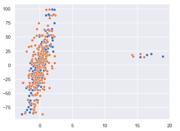
    As we can see from our data plotted that there are a few outliers in this.
    Let us see how Huber Regression and Linear Regression perform.

    huber = HuberRegressor().fit(X, y)
    
    lr = LinearRegression()
    lr.fit(X,y)
    
    print(f'True coefficients are {coef}')
    >>>True coefficients are [20.4923687  34.16981149]
    print(f'Huber coefficients are {huber.coef_}')
    >>>Huber coefficients are [17.79064252 31.01066091]
    print(f'Linear coefficients are {lr.coef_}')
    >>>Linear coefficients are [-1.92210833  7.02266092]

    Here we can see that the Huber coefficients are closer to the true coefficients, let us also visualise this by plotting the line.

    # use line_kws to set line label for legend
    
    fig, axes = plt.subplots(nrows=1, ncols=2, figsize=(10, 5))
    sns.regplot(x=X[:,1], y=y, color='b', 
     line_kws={'label':"y={0:.1f}x+{1:.1f}".format(huber.coef_[1],huber.intercept_)}, ax = axes[0])
    axes[1] = sns.regplot(x=X[:,1], y=y, color='r', 
     line_kws={'label':"y={0:.1f}x+{1:.1f}".format(lr.coef_[1],lr.intercept_)}, ax = axes[1])

    In these plots, we can clearly see the effect the outlier has on the regression output between Linear and Huber Regression.

  • Create a Machine Learning Demo Using Gradio

    Create a Machine Learning Demo Using Gradio

    Let’s build a Machine Learning Demo Using Gradio. We will be using the Titanic Dataset as an example.

    Link to the Google Collab Notebook.

    First, we will install and load the libraries.

    !pip install -q gradio
    !pip install -q catboost
    
    import pandas as pd
    import numpy as np
    import seaborn as sns
    
    sns.set_theme()

    Then let’s load the data and analyse the data types.

    df = sns.load_dataset("titanic")
    df.dtypes
    
    >>>
    survived          int64
    pclass            int64
    sex              object
    age             float64
    sibsp             int64
    parch             int64
    fare            float64
    embarked         object
    class          category
    who              object
    adult_male         bool
    deck           category
    embark_town      object
    alive            object
    alone              bool
    dtype: object

    We can see that we have the target as survived, the same is also as alive. Also, we will not be using all the features to create the model as we want to show how you can demo a Machine Learning model as a live predictor, so we don’t want to overburden the user.

    # Identifying features, we are keeping very few features as we want to simulate this using gradio
    features = [ 'pclass', 'sex', 'age', 'fare',
           'embarked']
    target = 'survived'

    Then we replace the missing values. For age, we will replace it with the median and for the embarked we will replace it with the most common value, which is S.

    # Filling missing values
    df['age'].fillna(np.nanquantile(df['age'], 0.5), inplace = True)
    df['embarked'].fillna("S", inplace = True)

    Now let’s build the model. No tuning, as getting the highest accuracy or f1-score is not objective.

    from catboost import CatBoostClassifier
    clf = CatBoostClassifier()
    
    # Creating features and target
    X = df[features]
    y = df[target]
    
    clf.fit(X,y, cat_features=['pclass', 'sex', 'embarked'])

    The we write the function which takes in the inputs and returns an output of whether the passenger would’ve survived or not.

    def predict(pclass:int = 3, 
                sex:str = "male", 
                age:float = 30, 
                fare:float = 100, 
                embarked:str = "S"):
      prediction_array = np.array([pclass, sex, age, fare, embarked])
      survived = clf.predict(prediction_array)
      if survived == 1:
        return f"The passenger survived"
      else:
        return f"The passenger did not survive"

    Now for the gradio demo, we want to take in these inputs with different gradio components, pass those as inputs to the prediction function and display the output. I go into much more detail on how this is done in the YouTube video, but the code snippet has comments which will help in case you don’t want to watch the explainer video.

    with gr.Blocks() as demo:
      # Keeping the three categorical feature input in the same row
      with gr.Row() as row1:
        pclass = gr.Dropdown(choices=[1,2,3], label= "pclass")
        sex = gr.Dropdown(choices =["male", "female"], label = "sex")
        embarked = gr.Dropdown(choices =["C", "Q", "S"], label = "embarked")
      # Creating slider for the two numerical inputs and also defining the limits for both
      age = gr.Slider(1,100, label = "age", interactive = True
      )
      fare = gr.Slider(10,600, label = "fare", interactive = True
      )
    
      submit = gr.Button(value = 'Predict')
    
      # Showing the output 
      output = gr.Textbox(label = "Whether the passenger survived ?", interactive = False,)
    
      # Defining what happens when the user clicks the submit button
      submit.click(predict, inputs = [pclass,sex, age,fare,embarked], outputs = [output])
    
    demo.launch(share = False, debug = False)

    Then you’ll get an output like this, where you’re free to play around with the features and see what the ML model’s output will be.

    Let me know in case you want to build something else with Gradio or want me to cover any ML topic in the comments below.

  • Understanding Naive Bayes – A simple yet powerful ML Model Part 1 – Bayes Theorem

    Naive Bayes is often not given enough credit, people when learning about ML often directly start using XgBoost or Random Forest models. While these models are good and will often achieve the task, we should also know about Naive Bayes, a Bayesian ML model, which was once used in production by tech giants like Google.

    But before we deep dive into Naive Bayes, we’ve to learn about the Bayes theorem itself.

    P(A/B) = \frac{P(B/A)*P(A)}{P(B)}

    It may seem daunting, but at its core, the formula is very simple to understand, all it provides is a way to calculate the probability of A given B has already happened. It is equal to the probability of B given that A has already happened multiplied by the probability of A divided by the probability of B happening.

    You might be daunted by mathematical jargon such as posterior and priors, but if you think in these simple terms then it is a very simple formula.

    Let’s take an example, and suppose that we don’t know Bayes theorem.

    We are told that a coin could be fair, or biased (always comes up heads). We observe two heads in a row and we have to find the probability that the coin being tossed is a fair coin.

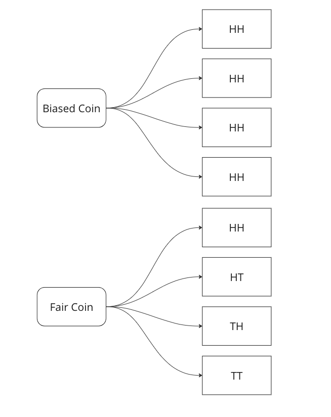
    Graphing all outcomes of two coin tosses by both a fair and a biased coin. Now we know that two heads came in a row. So we update our sample space with this given information.

    Here we can see that we can only attribute 1 sample out of 5 to a fair coin, so P(fair coin/HH) = 1/5. In a similar way, we can say P(biased coin/HH) = 4/5 as we can attribute 4 out of 5 sample points to the biased coin.

    Let us see if we can arrive on the same answer by using the Bayes Formula.

    P(fair coin/HH) = \frac{P(HH/fair coin)*P(fair coin)}{P(HH)} = \frac{1/4*1/2}{1*1/2+1/2*1/4}=1/5

    Breaking down the calculations –

    1. P (HH/fair coin) = 1/4 – we saw above that in 1/4 cases a fair coin will give two heads
    2. P ( fair coin) = 1/2 – we know that a coin could be biased or fair, this is what is known as a prior, here it is equally likely that the coin could be biased or fair.
    3. P (HH) = 1/2*1 + 1/2*1/4 – This is where most of the confusion rises related to Bayes theorem. We have to calculate the probability of getting two heads, considering both scenarios. In the case of a biased coin, it will always gives head, so the probability is 1. There is also half a chance to select it, so we multiply it by 0.5. Similarly, we know 1/4 is the probability to get HH with a fair coin, and there is 0.5 probability to select it.

    In the next part we will see how we can use this to create a very basic classifier in Python.

  • Machine Learning In Production – Skew and Drift

    In this post we will go over a very important concept when it comes to Machine Learning models, especially when you deploy them in production.

    Drift: Drift, or concept drift, refers to the phenomenon where the statistical properties of the target variable or the input features change over time. In other words, the relationship between the input variables and the target variable is no longer stable. This can occur due to various reasons such as changes in the underlying data-generating process, changes in user behaviour, or changes in the environment. Concept drift can have a significant impact on the performance of machine learning models because they are trained on historical data that may no longer be representative of the current state. Models may need to be continuously monitored and updated to adapt to concept drift, or specialized techniques for handling concept drift, such as online learning or ensemble methods, can be employed.

    To measure this type of skew, you can use various statistical measures –

    1. Feature Comparison: Calculate summary statistics (such as mean, median and variance) for each feature in the training dataset and the production dataset. Compare these statistics to identify any significant differences. You can use measures like the Kolmogorov-Smirnov test or the Jensen-Shannon divergence to quantify the skew between the distributions.
    2. Domain Expertise: Consult with domain experts or stakeholders who are familiar with the data and understand the expected distribution of features. They can provide insights into potential skewness or changes in feature distributions that might be critical to consider.
    3. Monitoring and Drift Detection: Implement a monitoring system to track the distribution of features in the production environment continuously. There are various drift detection algorithms available, such as the Drift-Detection Method (DDM) or the Page-Hinkley Test. These methods analyze the incoming data over time and detect significant changes or shifts in the feature distributions.

    By combining these techniques, you can gain insights into the skewness between the training and production feature distributions. Detecting and addressing such skewness is crucial for maintaining the performance and reliability of machine learning models in real-world scenarios.

  • Time Series Forecasting with Python – Part IV – Stationarity and Augmented Dicky Fuller Test

    In Part III, we saw trends and seasonality in time series data and how can we decompose it using statsmodel.

    In this part we will learn about stationarity in time series data and how can we test it using Augmented Dicky Fuller Test.

    Stationarity is a fundamental concept in time series analysis. It refers to the statistical properties of a time series remaining constant over time. In a stationary time series, the mean, variance, and autocovariance structure do not change with time.

    There are three main components of stationarity:

    1. Constant Mean: The mean of the time series should remain constant over time. This means that the average value of the series does not show any trend or systematic patterns as time progresses.
    2. Constant Variance: The variance (or standard deviation) of the series should remain constant over time. It implies that the spread or dispersion of the data points around the mean should not change as time progresses.
    3. Constant Autocovariance: The autocovariance between any two points in the time series should only depend on the time lag between them and not on the specific time at which they are observed. Autocovariance measures the linear relationship between a data point and its lagged values. In a stationary series, the autocovariance structure remains constant over time.

    Why is stationarity important in time series analysis? Stationarity is a crucial assumption for many time series models and statistical tests. If a time series violates the stationarity assumption, it can lead to unreliable and misleading results. For example, non-stationary series may exhibit trends, seasonality, or other time-dependent patterns that can distort statistical inference, prediction, and forecasting.

    To analyze non-stationary time series, researchers often use techniques like differencing to transform the series into a stationary form. Differencing involves computing the differences between consecutive observations to remove trends or other time-dependent patterns. Other methods, such as detrending or deseasonalizing, can also be employed depending on the specific characteristics of the series.

    It is important to note that while stationarity is desirable for many time series models, there are cases where non-stationary time series analysis is appropriate, such as when studying trending or seasonal data. However, in such cases, specialized models and techniques designed for non-stationary series need to be employed.

    Testing for Stationarity

    In Python, you can use various statistical tests to check for stationarity in a time series. One commonly used test is the Augmented Dickey-Fuller (ADF) test. The statsmodels library provides an implementation of the ADF test, which can be used to assess the stationarity of a time series.

    Here’s an example of how to perform the ADF test in Python:

    import pandas as pd
    from statsmodels.tsa.stattools import adfuller
    
    # Create a time series dataset
    data = [1, 2, 3, 4, 5, 6, 7, 8, 9, 10]
    
    # Perform the ADF test
    result = adfuller(data)
    
    # Extract the test statistic and p-value
    test_statistic = result[0]
    p_value = result[1]
    
    # Print the results
    print("ADF Test Statistic:", test_statistic)
    print("p-value:", p_value)
    

    The values come out to be

    ADF Test Statistic: 0.0
    p-value: 0.958532086060056

    The ADF test statistic measures the strength of the evidence against the null hypothesis of non-stationarity. A more negative (i.e., lower) test statistic indicates stronger evidence in favor of stationarity. The p-value represents the probability of observing the given test statistic if the null hypothesis of non-stationarity were true. A small p-value (typically less than 0.05) suggests rejecting the null hypothesis and concluding that the series is stationary. In this example we can clearly see that the null hypothesis was not rejected, meaning that the time series is not stationary.

    In the next part we will cover how we can convert non-stationary time series data to stationary time series.