Category: Python

  • Fuzzy Match DataFrames Using RapidFuzz and Pandas

    Today, we will be going over how you can match two DataFrames using RapidFuzz and Pandas.

    Suppose that you’ve two DataFrames, one having the product_id and the other having the product_price, with the key being the name. Since, names can be written differently, you’ve to match them.

    nameproduct_id
    M.D. LuffyA
    R. ZoroB
    SanjiC
    NamiD
    NarutoE
    name and product_id table

    nameproduct_price
    Monkey D. Luffy100
    Roronoa Zoro10
    Sannnji500
    Nami Chain1000
    Jiraiya300
    name and product_price table

    Since we can see that the name is written differently in the tables, we can’t do a direct left join using name as the key. We will be using fuzzy join using rapidfuzz library.

    # Importing the libraries
    import pandas as pd
    from rapidfuzz import fuzz
    from rapidfuzz.process import cdist, extract
    

    We will be using the extract process to find the closest matching key from the second table to use as merge in the first table.

    df1 = pd.DataFrame({"name": ["M.D. Luffy",
    "R. Zoro",
    "Sanji",
    "Nami", 
    "Naruto"],
    "product_id":["A", "B", "C", "D", "E"]})
    
    df2 = pd.DataFrame({"name": ["Monkey D. Luffy",
    "Roronoa Zoro",
    "Sannnji",
    "Nami Chan", 
                                "Jiraiya"],
    "product_price":[100,10,500,1000,300]})
    
    df1['join_key_tuple'] = df1['name'].apply(lambda x: extract(query = x, choices =df2['name'], score_cutoff=80))

    Here the query is the string you want to match, choices are all the choices to match against. You can pass a custom scorer as well, but here we are using the defualt scorer, and lastly we’re passing a cutoff which we will use to determine a successful match.

             name	    product_id	           join_key_tuple
    0	M.D. Luffy	A	        [(Monkey D. Luffy, 85.5, 0)]
    1	R. Zoro	        B	        [(Roronoa Zoro, 85.5, 1)]
    2	Sanji	        C	        [(Sannnji, 83.33333333333334, 2)]
    3	Nami	        D	        [(Nami Chan, 90.0, 3)]
    4	Naruto	        E	        []

    We can now extract the key to join from the returned tuple and make the join to have the price of the product against the product_id.

    df1["join_key"] = df1["join_key_tuple"].apply(lambda x: x[0][0] if x else np.nan)
    
    df1.merge(df2, how = "left", left_on = "join_key", right_on ="name")

    This way you can do fuzz join on two pandas dataframe.

  • Leave one out encoding – Encode your categorical variables to the target

    In case you want to use ML models on categorical variables, you’ve to encode them. The most common approach is one hot encoding. But what if you’ve too many categories and categorical variables, in this case, if you one hot encode, then you will end up with a very sparse matrix.

    Well there are ways you can tackle this, and I’ll be talking about one such way – Leave One Out Encoding.

    Leave-One-Out (LOO) is a cross-validation technique that involves splitting the data into training and test sets, where the test set contains a single sample, and the training set contains the remaining samples. LOO is performed for each sample in the dataset, and the model is trained and evaluated multiple times. In each split, you take the mean of the target for the category being encoded in train and add it to the test.

    Pros:

    1. Utilizes all available data: LOO ensures that each sample in the dataset is used as both a training and test instance. This maximizes the utilization of the available data and provides a more accurate estimate of model performance.
    2. Low bias: Since each training set contains all but one sample, the model is trained on almost the entire dataset. This reduces the bias introduced by other cross-validation techniques that use smaller training sets.
    3. Suitable for small datasets: LOO is particularly useful for small datasets where splitting the data into multiple folds might result in inadequate training data for model fitting.
    4. Unbiased estimator: LOO estimates tend to have lower bias compared to other cross-validation techniques, as the model is evaluated on independent samples.

    Cons:

    1. High computational cost: LOO requires training and evaluating the model as many times as there are samples in the dataset, making it computationally expensive, especially for large datasets.
    2. Variance and instability: LOO estimates can have high variance due to the high dependence between the training sets. Small changes in the data can lead to significant changes in the estimated performance. Thus, LOO estimates can be less stable than estimates obtained from other cross-validation methods.
    3. Overfitting risk: LOO can be prone to overfitting, as the model is trained on almost the entire dataset. This can result in overly optimistic performance estimates if the model is too complex or the dataset is noisy.
    4. Imbalanced class issues: If the dataset is imbalanced, LOO can lead to biased estimates, as each training set will typically contain a majority of samples from the majority class.

    Let’s walk through an examples.

    import pandas as pd
    import numpy as np
    from sklearn.model_selection import LeaveOneOut
    
    # Example data
    data = pd.DataFrame({
        'category': ['A', 'A', 'B', 'B', 'B', 'C', 'C', 'C'],
        'target': [1, 2, 3, 4, 5, 6, 7, 8]
    })
    
    # Create new column for leave-one-out encoded feature
    data['category_loo_encoded'] = np.nan
    

    Here we create a dummy data with a categorical variable and a numerical target.

    # Leave-One-Out Encoding
    loo = LeaveOneOut()
    
    for train_index, test_index in loo.split(data):
        X_train, X_test = data.iloc[train_index], data.iloc[test_index]
        
        # Calculate mean excluding the current row
        mean_target = X_train.loc[X_train['category'] == X_test['category'].values[0], 'target'].mean()
        
        # Assign leave-one-out encoded value
        data.loc[test_index, 'category_loo_encoded'] = mean_target
    
    # Display the result
    print(data)
    
    categorytargetcategory_loo_encoded
    A12
    A21
    B34.5
    B44
    B53.5
    C67.5
    C77
    C86.5

    There are also libraries that you can use which can help you with this. You can use category encoders. The advantage is that you can use parameters like sigma which adds noise and reduces overfitting.

    Here is the Python snippet on the same data.

    import category_encoders as ce
    # Create an instance of LeaveOneOutEncoder
    encoder = ce.LeaveOneOutEncoder(cols=['category'])
    
    # Perform leave-one-out encoding
    data_encoded = encoder.fit_transform(data['category'], data['target'])
    
    # Merge the encoded data with the original dataframe
    data = data.merge(data_encoded, how = 'left', left_index=True, right_index=True)
    
    # Display the result
    print(data)
    

    Here you can see we get the same result if we use category encoders as well.

    Thanks for reading and let me know in the comments in case you’ve any questions regarding Leave One Out Encoding.

  • Time Series Forecasting with Python Part 3 – Identifying Trends in Data

    While doing time series forecasting it is very important to analyse if your data has some trends, seasonality or periodicity in it. To identify if a time series has seasonality there are several techniques you can use.

    We will be using the following dummy data to see how we can test for seasonal trends in our data.

    sales = np.array([100, 120, 130, 150, 110, 130, 140, 160, 120, 140, 150, 170])
    
    quarters = ['Q1 2018', 'Q2 2018', 'Q3 2018', 'Q4 2018',
                'Q1 2019', 'Q2 2019', 'Q3 2019', 'Q4 2019',
                'Q1 2020', 'Q2 2020', 'Q3 2020', 'Q4 2020']
    
    1. Visual inspection – Just by looking at the plot of the time series, you can identify that there are visible patterns in it.

    In the image above you can clearly see that the sales grow from Q1 to Q3 and then decline in Q4 year on year.

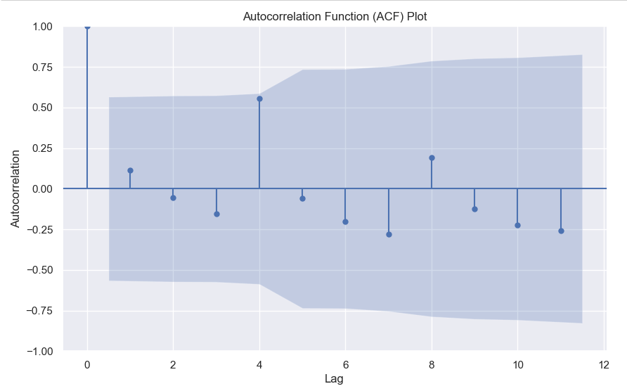
    2. Autocorrelation Function (ACF) – Autocorrelation refers to the correlation of a series with itself at different time lags. In other words, it quantifies the similarity or relationship between a data point and its preceding or lagged observations. The ACF helps identify any repeating patterns or dependencies within the time series data.

    In the ACF plot, if we see spikes at regular lag intervals, it indicates seasonality. We can take the help of plot_acf from the statsmodels package.

    import numpy as np
    import pandas as pd
    import matplotlib.pyplot as plt
    import statsmodels.api as sm
    from statsmodels.graphics.tsaplots import plot_acf
    
    # Generate ACF plot
    fig, ax = plt.subplots(figsize=(10, 6))
    plot_acf(sales, lags=11, ax=ax)  # Set lags to the number of quarters (12) minus 1
    
    plt.title('Autocorrelation Function (ACF) Plot')
    plt.xlabel('Lag')
    plt.ylabel('Autocorrelation')
    plt.show()
    

    Here we can clearly see a spike at 4, indicating what we already know that there is a seasonality present within the time series data.

    3. Decomposition –

    Decomposition is a technique used to break down a time series into its individual components: trend, seasonality, and residual (also known as error or noise). The decomposition process allows us to isolate and analyze these components separately, providing insights into the underlying patterns and variations within the time series data.

    There are two commonly used types of decomposition:

    1. Additive
    2. Multiplicative.
    1. Additive Decomposition: In additive decomposition, the time series is assumed to be the sum of its components. It is expressed as:Y(t) = Trend(t) + Seasonality(t) + Residual(t)
      The additive decomposition assumes that the magnitude of the seasonal fluctuations remains constant throughout the time series.
    2. Multiplicative Decomposition: In multiplicative decomposition, the time series is assumed to be the product of its components. It is expressed as:Y(t) = Trend(t) * Seasonality(t) * Residual(t)
      Multiplicative decomposition assumes that the seasonal fluctuations grow or shrink proportionally with the trend.

    Again we will be using the statsmodels package to perform seasonal decomposition.

    from statsmodels.tsa.seasonal import seasonal_decompose
    
    # Create a pandas Series with a quarterly frequency
    index = pd.date_range(start='2018-01-01', periods=len(sales), freq='Q')
    series = pd.Series(sales, index=index)
    
    # Perform seasonal decomposition
    decomposition = seasonal_decompose(series, model='additive')
    
    # Extract the components
    trend = decomposition.trend
    seasonality = decomposition.seasonal
    residuals = decomposition.resid
    
    # Plot the components
    plt.figure(figsize=(10, 8))
    plt.subplot(411)
    plt.plot(series, label='Original')
    plt.legend(loc='best')
    plt.subplot(412)
    plt.plot(trend, label='Trend')
    plt.legend(loc='best')
    plt.subplot(413)
    plt.plot(seasonality, label='Seasonality')
    plt.legend(loc='best')
    plt.subplot(414)
    plt.plot(residuals, label='Residuals')
    plt.legend(loc='best')
    plt.tight_layout()
    plt.show()
    

    In this dummy example, we can clearly see via this decomposition that there is an upwards trend in the data along with a quarterly seasonality.

    There are a couple more tests left to explore, but we will pick those up in the next part where we will continue to explore this seasonality and trends in time series data.

  • Correlation between numerical and categorical variable – Point Biserial Correlation

    We all know about Pearson correlation among numerical variables. But what if your target is binary and you want to calculate the correlation between numerical features and binary target. Well, you can do so using point-biserial correlation.

    The point-biserial correlation coefficient is a statistical measure that quantifies the relationship between a continuous variable and a dichotomous (binary) variable. It is an extension of the Pearson correlation coefficient, which measures the linear relationship between two continuous variables.

    The point-biserial correlation coefficient is specifically designed to assess the relationship between a continuous variable and a binary variable that represents two categories or states. It is often used when one variable is naturally dichotomous (e.g., pass/fail, yes/no) and the other variable is continuous (e.g., test scores, age).

    The coefficient ranges between -1 and +1, similar to the Pearson correlation coefficient. A value of +1 indicates a perfect positive relationship, -1 indicates a perfect negative relationship, and 0 indicates no relationship.

    The calculation of the point-biserial correlation coefficient involves comparing the means of the continuous variable for each category of the binary variable and considering the variability within each category. The formula for calculating the point-biserial correlation coefficient is:

    r_{pb} = \frac{M_{1} - M_{0}}{s_{n}}\sqrt{pq}

    Here

    • M1 is the mean of the continuous variable for category 1 of the binary variable.
    • M0 is the mean of the continuous variable for category 0 of the binary variable.
    • s_{n} is the standard deviation of the entire population if available.
    • p = Proportion of cases in the “0” group.
    • q = Proportion of cases in the “1” group.

    You can also easily calculate this in Python using the scipy library.

    import scipy.stats as stats
    
    # Calculate the point-biserial correlation coefficient
    r_pb, p_value = stats.pointbiserialr(continuous_variable, binary_variable)
    

    Let me know in the comments in case you’ve any questions regarding the point-biserial correlation.

  • Cohen’s D – How to measure the difference in distributions

    While the t-test or Mann-Whitney U test can tell you whether two distributions are different from each other, it doesn’t tell you the degree to which they are different.

    For this purpose, you can calculate Cohen’s D.

    Cohens'D = \frac{(M1-M2)}{S_{pooled}}

    Where the pooled standard deviation can be defined as

    S_{pooled} = \sqrt{\frac{s_{1}^{2} + s_{1}^{2}}{2}}

    After calculating Cohen’s D you can gauge the difference via this thumb rule –

    • Small effect = 0.2
    • Medium Effect = 0.5
    • Large Effect = 0.8

    Below you can find the code to calculate Cohen’s D in python

    import numpy as np
    
    def cohens_d(x,y):
        var_x = np.var(x)
        var_y = np.var(y)
        mean_x = np.mean(x)
        mean_y = np.mean(y)
        pool_variance = np.sqrt((var_x**2 + var_y**2)/2)
        return (mean_x - mean_y)/pool_variance

    Write in the comments in case you’ve any questions regarding cohen’s D.

  • Numpy Argpartition – How it works?

    We all know that to find the maximum value index we can use argmax, but what if you want to find the top 3 or top 5 values. Then you can use argpartition.

    Let’s take an example array.

    x = [10,1,6,8,2,12,20,15,56,23]

    In this array, it’s very easy to find the maximum value index, it’s 8.

    But what if you want the top 3 or top 5, then you can use np.argmax.

    How it works is that it first sorts the array and then partitions the array on the kth element. All elements lower than the kth element will be behind it and larger ones will be after it.

    Let’s see with a few examples.

    idx = np.argpartition(x, kth=-3)
    print(idx)
    >>> [1 4 2 3 0 5 7 6 8 9]
    print([x[i] for i in idx ])
    >>> [1, 2, 6, 8, 10, 12, 15, 20, 56, 23]

    Here you can see that you get the top 3 indices as the last 3 values of the list, you can simply filter the values you can want by using idx[-3:].

    Similarly for the top 5 –

    idx = np.argpartition(x, kth=-5)
    print(idx[-5:])
    >>> [5 7 6 8 9]

    Hopefully, this post explains how you can use arg-partition to get the top k element indices. If you have any questions, feel free to ask in the comments or here on my Youtube Channel.

  • K-Nearest Neighbour Algorithm Explained

    KNN (K-Nearest Neighbours) is a supervised learning algorithm which uses the nearest neighbours to classify a new data point.

    The tricky part is selecting the optimal k for the model.

    sklearn.neighbors.KNeighborsClassifier(n_neighbors=5*weights='uniform'algorithm='auto'leaf_size=30p=2metric='minkowski'metric_params=Nonen_jobs=None)

    As you can see the weights by default is uniform and the n_neighbours is by default 5. Large values of k smooth things, but a very small value of k will be unreliable and could be affected by outliers.

    You can pick the optimal value of the k by tuning the hyperparameter using GridSearchCV.

    Then there is the value of p, which is by 2, meaning that it uses the euclidean distance, you can set it to 1 to use Manhattan distance. This is the distance it uses to chose the nearest points for classification.

    Let’s code this in python-

    from sklearn.neighbors import KNeighborsClassifier
    from sklearn.datasets import load_iris
    from sklearn.model_selection import GridSearchCV
    
    X, y = load_iris()['data'], load_iris()['target']
    
    #defining the search grid
    param_grid = {'n_neighbors': np.arange(3,10,1),
                 'p': [1,2,3]}
    
    grid_search = GridSearchCV(estimator=KNeighborsClassifier(), param_grid=param_grid, scoring='accuracy', cv = 3)
    
    grid_search.fit(X,y)
    
    print(grid_search.best_params_)
    >>> {'n_neighbors': 4, 'p': 2}
    print(grid_search.best_score_)
    >>>0.9866666666666667
    

    Hope this post cleared how you can use KNN in your machine learning problems, and if you want me to write about any ML topic, just drop a comment below.

  • Pandas Essentials – Apply

    I often find people who are just starting out using pandas struggling to grasp when they should be using axis=0 and axis=1. While I go into a lot more detail with examples in the Youtube video above, you should keep this in mind.

    When you use axis=0, pandas only looks at the value being passed, but when you use axis=1, by default it assumes a pandas Series being passed, so it looks for the index. So when you write a function which references multiple columns and use apply, use axis=1 and remember that it considers each row as a pandas Series, with the column names in the index.

  • Pandas Essentials – Transform and Qcut

    Suppose you want to calculate aggregated count features and add them to your data frame as a feature. What you would typically do is, create a grouped data frame and then do a join. What if you can do all that in just one single line of code. Here you can use the transform functionality in pandas.

    import numpy as np
    import pandas as pd
    import seaborn as sns
    df = sns.load_dataset('titanic')
    df.head()
    

    Using df['cnt_class_town'] = df.groupby(['class', 'embark_town']).transform('size') we can directly get our desired feature in the data frame.

    Again, if you want to create any sort of binned features based on the quantiles, usually first you would create a function and then use pandas apply to add that bucket to your data. Here again, you can directly use qcut functionality from pandas, pandas.qcut(x, q, labels=None, retbins=False, precision=3, duplicates='raise') to create the buckets in just one line of code.

    Let’s take an example where we want to bin the age column into 4 categories, we can do so by running this one line of code –

    df['age_bucket'] = pd.qcut(df['age'], q = [0,0.25,0.5,0.75, 1], labels = ["A", "B", "C", "D"])

    Do note that the labels have to be 1 less than your quantiles (q). The explanation as to why I have explained in the Youtube video (see above).

    Hopefully, this clears up some pandas concepts and lets you write faster and neater code.