Articles

  • Time Series Forecasting with Python Part 3 – Identifying Trends in Data

    While doing time series forecasting it is very important to analyse if your data has some trends, seasonality or periodicity in it. To identify if a time series has seasonality there are several techniques you can use.

    We will be using the following dummy data to see how we can test for seasonal trends in our data.

    sales = np.array([100, 120, 130, 150, 110, 130, 140, 160, 120, 140, 150, 170])
    
    quarters = ['Q1 2018', 'Q2 2018', 'Q3 2018', 'Q4 2018',
                'Q1 2019', 'Q2 2019', 'Q3 2019', 'Q4 2019',
                'Q1 2020', 'Q2 2020', 'Q3 2020', 'Q4 2020']
    
    1. Visual inspection – Just by looking at the plot of the time series, you can identify that there are visible patterns in it.

    In the image above you can clearly see that the sales grow from Q1 to Q3 and then decline in Q4 year on year.

    2. Autocorrelation Function (ACF) – Autocorrelation refers to the correlation of a series with itself at different time lags. In other words, it quantifies the similarity or relationship between a data point and its preceding or lagged observations. The ACF helps identify any repeating patterns or dependencies within the time series data.

    In the ACF plot, if we see spikes at regular lag intervals, it indicates seasonality. We can take the help of plot_acf from the statsmodels package.

    import numpy as np
    import pandas as pd
    import matplotlib.pyplot as plt
    import statsmodels.api as sm
    from statsmodels.graphics.tsaplots import plot_acf
    
    # Generate ACF plot
    fig, ax = plt.subplots(figsize=(10, 6))
    plot_acf(sales, lags=11, ax=ax)  # Set lags to the number of quarters (12) minus 1
    
    plt.title('Autocorrelation Function (ACF) Plot')
    plt.xlabel('Lag')
    plt.ylabel('Autocorrelation')
    plt.show()
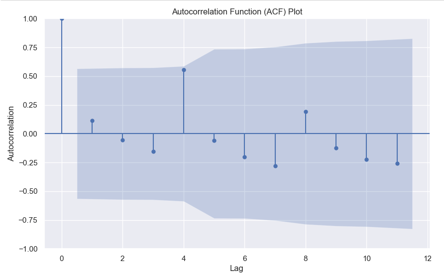
    

    Here we can clearly see a spike at 4, indicating what we already know that there is a seasonality present within the time series data.

    3. Decomposition –

    Decomposition is a technique used to break down a time series into its individual components: trend, seasonality, and residual (also known as error or noise). The decomposition process allows us to isolate and analyze these components separately, providing insights into the underlying patterns and variations within the time series data.

    There are two commonly used types of decomposition:

    1. Additive
    2. Multiplicative.
    1. Additive Decomposition: In additive decomposition, the time series is assumed to be the sum of its components. It is expressed as:Y(t) = Trend(t) + Seasonality(t) + Residual(t)
      The additive decomposition assumes that the magnitude of the seasonal fluctuations remains constant throughout the time series.
    2. Multiplicative Decomposition: In multiplicative decomposition, the time series is assumed to be the product of its components. It is expressed as:Y(t) = Trend(t) * Seasonality(t) * Residual(t)
      Multiplicative decomposition assumes that the seasonal fluctuations grow or shrink proportionally with the trend.

    Again we will be using the statsmodels package to perform seasonal decomposition.

    from statsmodels.tsa.seasonal import seasonal_decompose
    
    # Create a pandas Series with a quarterly frequency
    index = pd.date_range(start='2018-01-01', periods=len(sales), freq='Q')
    series = pd.Series(sales, index=index)
    
    # Perform seasonal decomposition
    decomposition = seasonal_decompose(series, model='additive')
    
    # Extract the components
    trend = decomposition.trend
    seasonality = decomposition.seasonal
    residuals = decomposition.resid
    
    # Plot the components
    plt.figure(figsize=(10, 8))
    plt.subplot(411)
    plt.plot(series, label='Original')
    plt.legend(loc='best')
    plt.subplot(412)
    plt.plot(trend, label='Trend')
    plt.legend(loc='best')
    plt.subplot(413)
    plt.plot(seasonality, label='Seasonality')
    plt.legend(loc='best')
    plt.subplot(414)
    plt.plot(residuals, label='Residuals')
    plt.legend(loc='best')
    plt.tight_layout()
    plt.show()
    

    In this dummy example, we can clearly see via this decomposition that there is an upwards trend in the data along with a quarterly seasonality.

    There are a couple more tests left to explore, but we will pick those up in the next part where we will continue to explore this seasonality and trends in time series data.

  • 10 Decision Tree Questions Every Data Scientist Needs to Know

    You may or may not be asked such questions in an interview, but often these kind of questions come up in screening tests which have MCQs.

  • Correlation between numerical and categorical variable – Point Biserial Correlation

    We all know about Pearson correlation among numerical variables. But what if your target is binary and you want to calculate the correlation between numerical features and binary target. Well, you can do so using point-biserial correlation.

    The point-biserial correlation coefficient is a statistical measure that quantifies the relationship between a continuous variable and a dichotomous (binary) variable. It is an extension of the Pearson correlation coefficient, which measures the linear relationship between two continuous variables.

    The point-biserial correlation coefficient is specifically designed to assess the relationship between a continuous variable and a binary variable that represents two categories or states. It is often used when one variable is naturally dichotomous (e.g., pass/fail, yes/no) and the other variable is continuous (e.g., test scores, age).

    The coefficient ranges between -1 and +1, similar to the Pearson correlation coefficient. A value of +1 indicates a perfect positive relationship, -1 indicates a perfect negative relationship, and 0 indicates no relationship.

    The calculation of the point-biserial correlation coefficient involves comparing the means of the continuous variable for each category of the binary variable and considering the variability within each category. The formula for calculating the point-biserial correlation coefficient is:

    r_{pb} = \frac{M_{1} - M_{0}}{s_{n}}\sqrt{pq}

    Here

    • M1 is the mean of the continuous variable for category 1 of the binary variable.
    • M0 is the mean of the continuous variable for category 0 of the binary variable.
    • s_{n} is the standard deviation of the entire population if available.
    • p = Proportion of cases in the “0” group.
    • q = Proportion of cases in the “1” group.

    You can also easily calculate this in Python using the scipy library.

    import scipy.stats as stats
    
    # Calculate the point-biserial correlation coefficient
    r_pb, p_value = stats.pointbiserialr(continuous_variable, binary_variable)
    

    Let me know in the comments in case you’ve any questions regarding the point-biserial correlation.

  • Using Custom Eval Metric with Catboost

    Catboost offers a multitude of evaluation metrics. You can read all about them here, but often you want to use a custom evaluation metric.

    For example in this ongoing Kaggle competition, the evaluation metric is Balanced Log Loss. Such a metric is not supported by catboost. By this I mean that you can’t simply write this and expect it to work.

    from catboost import CatBoostClassifier
    model = CatBoostClassifier(eval_metric="BalancedLogLoss")
    model.fit(X,y)

    This will give you an error. What you need to define is a custom eval metric class. The template for which is pretty simple.

    class UserDefinedMetric(object):
        def is_max_optimal(self):
            # Returns whether great values of metric are better
            pass
    
        def evaluate(self, approxes, target, weight):
            # approxes is a list of indexed containers
            # (containers with only __len__ and __getitem__ defined),
            # one container per approx dimension.
            # Each container contains floats.
            # weight is a one dimensional indexed container.
            # target is a one dimensional indexed container.
    
            # weight parameter can be None.
            # Returns pair (error, weights sum)
            pass
    
        def get_final_error(self, error, weight):
            # Returns final value of metric based on error and weight
            pass


    Here there are three parts to the class.

    1. get_final_error – Here you can just return the error, or if you want to modify the error like take the log or square root, you can do so.
    2. is_max_optimal – Here you return True if greater is better like accuracy etc, otherwise return False.
    3. evaluate – Here lies the meat of your code where you’ll actually write what metric you want. Remember that the approxes are the predictions and you need to take approxes[0] as the output.

    Below you will find the code for Balanced Log Loss as an eval metric.

    
    class BalancedLogLoss:
        def get_final_error(self, error, weight):
            return error
    
        def is_max_optimal(self):
            return False
    
        def evaluate(self, approxes, target, weight):
            y_true = target.astype(int)
            y_pred = approxes[0].astype(float)
            
            y_pred = np.clip(y_pred, 1e-15, 1 - 1e-15)
            individual_loss = -(y_true * np.log(y_pred) + (1 - y_true) * np.log(1 - y_pred))
            
            class_weights = np.where(y_true == 1, np.sum(y_true == 0) / np.sum(y_true == 1), np.sum(y_true == 1) / np.sum(y_true == 0))
            weighted_loss = individual_loss * class_weights
            
            balanced_logloss = np.mean(weighted_loss)
            
            return balanced_logloss, 0.0

    Then you can simply call this in your grid search or randomised search like this –model = CatBoostClassifier(verbose = False,eval_metric=BalancedLogLoss())

    Write in the comments below if you’ve any questions related to custom eval metrics in Catboost or any ML framework.

  • Balanced Log Loss, Metric for imbalanced classification problems

    We all know about LogLoss which is the main loss function when it comes to binary classification problems. The formula is given below –


    LogLoss = -\frac{1}{N} \sum_{i=1}^{N} \left( y_i \log(p_i) + (1 - y_i) \log(1 - p_i) \right)

    • (N) is the total number of samples.
    • (y_i) is the true label of sample (i) (0 or 1).
    • (p_i) is the predicted probability of sample (i) belonging to class 1.

    Imbalanced Log Loss:
    The imbalanced log loss accounts for class imbalance by introducing class weights. It can be defined as:


    ImbalancedLogLoss = -\frac{1}{N} \sum_{i=1}^{N} w_i \left( y_i \log(p_i) + (1 - y_i) \log(1 - p_i) \right)

    • (N) is the total number of samples.
    • (y_i) is the true label of sample (i) (0 or 1).
    • (p_i) is the predicted probability of sample (i) belonging to class 1.
    • (w_i) is the weight assigned to sample (i) based on its class label. For example, if class 0 has fewer samples than class 1, (w_i) can be set to the ratio of class 1 samples to class 0 samples.

    Here is the python code that you can call to evaluate in Catboost –

    class BalancedLogLoss:
        def get_final_error(self, error, weight):
            return error
    
        def is_max_optimal(self):
            return False
    
        def evaluate(self, approxes, target, weight):
            y_true = target.astype(int)
            y_pred = approxes[0].astype(float)
            
            y_pred = np.clip(y_pred, 1e-15, 1 - 1e-15)
            individual_loss = -(y_true * np.log(y_pred) + (1 - y_true) * np.log(1 - y_pred))
            
            class_weights = np.where(y_true == 1, np.sum(y_true == 0) / np.sum(y_true == 1), np.sum(y_true == 1) / np.sum(y_true == 0))
            weighted_loss = individual_loss * class_weights
            
            balanced_logloss = np.mean(weighted_loss)
            
            return balanced_logloss, 0.0

    Advantages of Imbalanced LogLoss –

    1. Handles Class Imbalance: The imbalanced log loss takes into account the class distribution and assigns appropriate weights to each class. This allows the model to effectively handle imbalanced datasets, where one class may have significantly fewer samples than the other. By assigning higher weights to the minority class, the model focuses more on correctly classifying the minority class, reducing the impact of class imbalance.
    2. Improves Model Performance: By incorporating class weights in the loss function, the imbalanced log loss guides the model to optimize its predictions specifically for imbalanced datasets. This can lead to improved model performance, as the model becomes more sensitive to the minority class and learns to make better predictions for both classes.
    3. Flexible Weighting Strategies: The imbalanced log loss allows flexibility in assigning weights to different classes. Various weighting strategies can be used based on the characteristics of the dataset and the specific problem at hand. For example, weights can be inversely proportional to class frequencies or can be set manually based on domain knowledge. This flexibility enables the model to adapt to different levels of class imbalance and prioritize the correct classification of the minority class accordingly.
    4. Evaluation Metric Consistency: When using the imbalanced log loss as both the training loss and evaluation metric, it ensures consistency in model optimization and evaluation. By optimizing the model to minimize the imbalanced log loss during training, the model’s performance is directly aligned with the evaluation metric, providing a fair assessment of the model’s effectiveness in handling class imbalance.

    In conclusion, if you have an imbalanced class problem, you can try this eval metric in your models as well.

    .

  • Cohen’s D – How to measure the difference in distributions

    While the t-test or Mann-Whitney U test can tell you whether two distributions are different from each other, it doesn’t tell you the degree to which they are different.

    For this purpose, you can calculate Cohen’s D.

    Cohens'D = \frac{(M1-M2)}{S_{pooled}}

    Where the pooled standard deviation can be defined as

    S_{pooled} = \sqrt{\frac{s_{1}^{2} + s_{1}^{2}}{2}}

    After calculating Cohen’s D you can gauge the difference via this thumb rule –

    • Small effect = 0.2
    • Medium Effect = 0.5
    • Large Effect = 0.8

    Below you can find the code to calculate Cohen’s D in python

    import numpy as np
    
    def cohens_d(x,y):
        var_x = np.var(x)
        var_y = np.var(y)
        mean_x = np.mean(x)
        mean_y = np.mean(y)
        pool_variance = np.sqrt((var_x**2 + var_y**2)/2)
        return (mean_x - mean_y)/pool_variance

    Write in the comments in case you’ve any questions regarding cohen’s D.

  • MSE vs MSLE, When to use what metric?

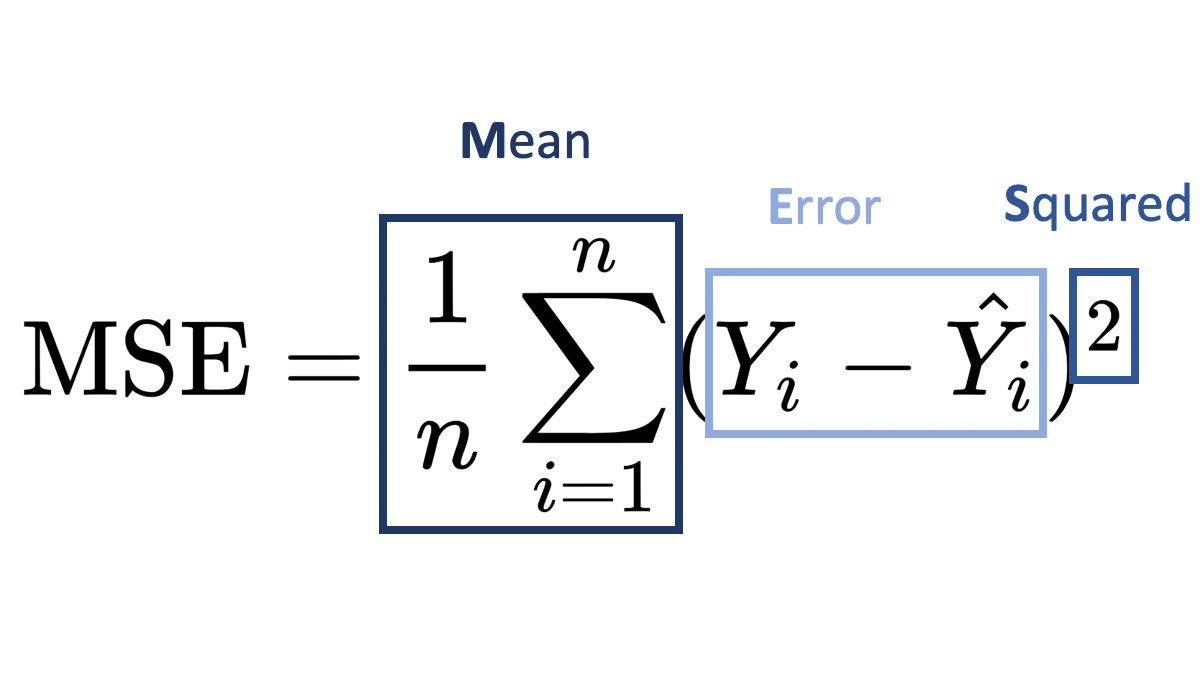
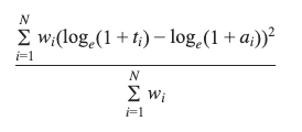
    MSLE (Mean Squared Logarithmic Error) and MSE (Mean Squared Error) are both loss functions that you can use in regression problems. But when should you use what metric?

    Mean Squared Error (MSE):

    It is useful when your target has a normal or normal-like distribution, as it is sensitive to outliers.

    An example is below –

    In this case using MSE as your loss function makes much more sense than MSLE.

    Mean Squared Logarithmic Error (MSLE):

    • MSLE measures the average squared logarithmic difference between the predicted and actual values.
    • MSLE treats smaller errors as less significant than larger ones due to the logarithmic transformation.
    • It is less sensitive to outliers than MSE since the logarithmic transformation compresses the error values.

    An example where you can use MSLE –

    Here if you use MSE then due to the exponential nature of the target, it will be sensitive to outliers and MSLE is a better metric, remember that MSLE cannot be used for optimisation, it is only an evaluation metric.

    In general, the choice between MSLE and MSE depends on the nature of the problem, the distribution of errors, and the desired behavior of the model. It’s often a good idea to experiment with both and evaluate their performance using appropriate evaluation metrics before finalizing the choice.

  • Numpy Argpartition – How it works?

    We all know that to find the maximum value index we can use argmax, but what if you want to find the top 3 or top 5 values. Then you can use argpartition.

    Let’s take an example array.

    x = [10,1,6,8,2,12,20,15,56,23]

    In this array, it’s very easy to find the maximum value index, it’s 8.

    But what if you want the top 3 or top 5, then you can use np.argmax.

    How it works is that it first sorts the array and then partitions the array on the kth element. All elements lower than the kth element will be behind it and larger ones will be after it.

    Let’s see with a few examples.

    idx = np.argpartition(x, kth=-3)
    print(idx)
    >>> [1 4 2 3 0 5 7 6 8 9]
    print([x[i] for i in idx ])
    >>> [1, 2, 6, 8, 10, 12, 15, 20, 56, 23]

    Here you can see that you get the top 3 indices as the last 3 values of the list, you can simply filter the values you can want by using idx[-3:].

    Similarly for the top 5 –

    idx = np.argpartition(x, kth=-5)
    print(idx[-5:])
    >>> [5 7 6 8 9]

    Hopefully, this post explains how you can use arg-partition to get the top k element indices. If you have any questions, feel free to ask in the comments or here on my Youtube Channel.

  • The Making Of A Manager – An Insightful Read into people who are starting their journey as a leader

    Julie Zhou’s The Making Of A Manager does one thing and excels at driving home the point, that being a manager is more than assigning tasks to your team members and making sure that they adhere to the set deadlines.

    It is instead someone who has the responsibility that both the collective and individual goals are achieved. It is someone who understands the bigger picture and at times can also take the harder decisions. Being a manager also involves being straight in your feedback and it also involves a learning curve where you first have to manage yourself.

    The decisions taken by a manager in how he handles the growth of his team or which persons he brings into the team will dictate the direction that the team takes. A good manager will take a mediocre team and with the team make it into an outstanding one whereas a bad manager or someone in the wrong place at the wrong time will take a high-performing team and make it into a mediocre one.

    All the lessons in the book like balancing between not being a micro manager and being too distant from the team are nothing new and things we already know, the beauty of the book is in how it lays emphasis on these points and shines further clarity on them with some personal anecdotes.

    If you want to buy the book, you can do so from by visiting this link. It also supports the blog.

    Rating: 4 out of 5.