I’ll add the code and explanations as text here, but everything is explained in the Youtube video.
Link to collab notebook.

I’ll add the code and explanations as text here, but everything is explained in the Youtube video.
Link to collab notebook.
Naive Bayes is often not given enough credit, people when learning about ML often directly start using XgBoost or Random Forest models. While these models are good and will often achieve the task, we should also know about Naive Bayes, a Bayesian ML model, which was once used in production by tech giants like Google.
But before we deep dive into Naive Bayes, we’ve to learn about the Bayes theorem itself.
It may seem daunting, but at its core, the formula is very simple to understand, all it provides is a way to calculate the probability of A given B has already happened. It is equal to the probability of B given that A has already happened multiplied by the probability of A divided by the probability of B happening.
You might be daunted by mathematical jargon such as posterior and priors, but if you think in these simple terms then it is a very simple formula.
Let’s take an example, and suppose that we don’t know Bayes theorem.
We are told that a coin could be fair, or biased (always comes up heads). We observe two heads in a row and we have to find the probability that the coin being tossed is a fair coin.
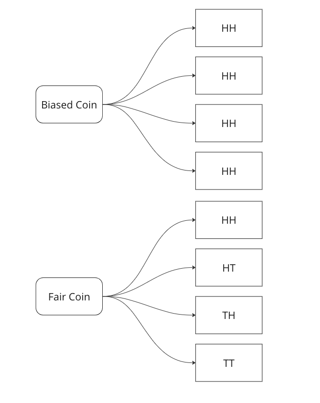
Graphing all outcomes of two coin tosses by both a fair and a biased coin. Now we know that two heads came in a row. So we update our sample space with this given information.

Here we can see that we can only attribute 1 sample out of 5 to a fair coin, so P(fair coin/HH) = 1/5. In a similar way, we can say P(biased coin/HH) = 4/5 as we can attribute 4 out of 5 sample points to the biased coin.
Let us see if we can arrive on the same answer by using the Bayes Formula.

Breaking down the calculations –
In the next part we will see how we can use this to create a very basic classifier in Python.
In this post we will go over a very important concept when it comes to Machine Learning models, especially when you deploy them in production.
Drift: Drift, or concept drift, refers to the phenomenon where the statistical properties of the target variable or the input features change over time. In other words, the relationship between the input variables and the target variable is no longer stable. This can occur due to various reasons such as changes in the underlying data-generating process, changes in user behaviour, or changes in the environment. Concept drift can have a significant impact on the performance of machine learning models because they are trained on historical data that may no longer be representative of the current state. Models may need to be continuously monitored and updated to adapt to concept drift, or specialized techniques for handling concept drift, such as online learning or ensemble methods, can be employed.
To measure this type of skew, you can use various statistical measures –
By combining these techniques, you can gain insights into the skewness between the training and production feature distributions. Detecting and addressing such skewness is crucial for maintaining the performance and reliability of machine learning models in real-world scenarios.
In Part III, we saw trends and seasonality in time series data and how can we decompose it using statsmodel.
In this part we will learn about stationarity in time series data and how can we test it using Augmented Dicky Fuller Test.
Stationarity is a fundamental concept in time series analysis. It refers to the statistical properties of a time series remaining constant over time. In a stationary time series, the mean, variance, and autocovariance structure do not change with time.
There are three main components of stationarity:
Why is stationarity important in time series analysis? Stationarity is a crucial assumption for many time series models and statistical tests. If a time series violates the stationarity assumption, it can lead to unreliable and misleading results. For example, non-stationary series may exhibit trends, seasonality, or other time-dependent patterns that can distort statistical inference, prediction, and forecasting.
To analyze non-stationary time series, researchers often use techniques like differencing to transform the series into a stationary form. Differencing involves computing the differences between consecutive observations to remove trends or other time-dependent patterns. Other methods, such as detrending or deseasonalizing, can also be employed depending on the specific characteristics of the series.
It is important to note that while stationarity is desirable for many time series models, there are cases where non-stationary time series analysis is appropriate, such as when studying trending or seasonal data. However, in such cases, specialized models and techniques designed for non-stationary series need to be employed.
Testing for Stationarity
In Python, you can use various statistical tests to check for stationarity in a time series. One commonly used test is the Augmented Dickey-Fuller (ADF) test. The statsmodels library provides an implementation of the ADF test, which can be used to assess the stationarity of a time series.
Here’s an example of how to perform the ADF test in Python:
import pandas as pd
from statsmodels.tsa.stattools import adfuller

# Create a time series dataset
data = [1, 2, 3, 4, 5, 6, 7, 8, 9, 10]

# Perform the ADF test
result = adfuller(data)

# Extract the test statistic and p-value
test_statistic = result[0]
p_value = result[1]

# Print the results
print("ADF Test Statistic:", test_statistic)
print("p-value:", p_value)
The values come out to be
ADF Test Statistic: 0.0
p-value: 0.958532086060056
The ADF test statistic measures the strength of the evidence against the null hypothesis of non-stationarity. A more negative (i.e., lower) test statistic indicates stronger evidence in favor of stationarity. The p-value represents the probability of observing the given test statistic if the null hypothesis of non-stationarity were true. A small p-value (typically less than 0.05) suggests rejecting the null hypothesis and concluding that the series is stationary. In this example we can clearly see that the null hypothesis was not rejected, meaning that the time series is not stationary.
In the next part we will cover how we can convert non-stationary time series data to stationary time series.
In case you want to use ML models on categorical variables, you’ve to encode them. The most common approach is one hot encoding. But what if you’ve too many categories and categorical variables, in this case, if you one hot encode, then you will end up with a very sparse matrix.
Well there are ways you can tackle this, and I’ll be talking about one such way – Leave One Out Encoding.
Leave-One-Out (LOO) is a cross-validation technique that involves splitting the data into training and test sets, where the test set contains a single sample, and the training set contains the remaining samples. LOO is performed for each sample in the dataset, and the model is trained and evaluated multiple times. In each split, you take the mean of the target for the category being encoded in train and add it to the test.
Pros:
Cons:
Let’s walk through an examples.
import pandas as pd
import numpy as np
from sklearn.model_selection import LeaveOneOut

# Example data
data = pd.DataFrame({
    'category': ['A', 'A', 'B', 'B', 'B', 'C', 'C', 'C'],
    'target': [1, 2, 3, 4, 5, 6, 7, 8]
})

# Create new column for leave-one-out encoded feature
data['category_loo_encoded'] = np.nan
Here we create a dummy data with a categorical variable and a numerical target.
# Leave-One-Out Encoding
loo = LeaveOneOut()

for train_index, test_index in loo.split(data):
    X_train, X_test = data.iloc[train_index], data.iloc[test_index]

    # Calculate mean excluding the current row
    mean_target = X_train.loc[X_train['category'] == X_test['category'].values[0], 'target'].mean()

    # Assign leave-one-out encoded value
    data.loc[test_index, 'category_loo_encoded'] = mean_target

# Display the result
print(data)
| category | target | category_loo_encoded |
| A | 1 | 2 |
| A | 2 | 1 |
| B | 3 | 4.5 |
| B | 4 | 4 |
| B | 5 | 3.5 |
| C | 6 | 7.5 |
| C | 7 | 7 |
| C | 8 | 6.5 |
There are also libraries that you can use which can help you with this. You can use category encoders. The advantage is that you can use parameters like sigma which adds noise and reduces overfitting.
Here is the Python snippet on the same data.
import category_encoders as ce
# Create an instance of LeaveOneOutEncoder
encoder = ce.LeaveOneOutEncoder(cols=['category'])

# Perform leave-one-out encoding
data_encoded = encoder.fit_transform(data['category'], data['target'])

# Merge the encoded data with the original dataframe
data = data.merge(data_encoded, how = 'left', left_index=True, right_index=True)

# Display the result
print(data)

Here you can see we get the same result if we use category encoders as well.
Thanks for reading and let me know in the comments in case you’ve any questions regarding Leave One Out Encoding.
While doing time series forecasting it is very important to analyse if your data has some trends, seasonality or periodicity in it. To identify if a time series has seasonality there are several techniques you can use.
We will be using the following dummy data to see how we can test for seasonal trends in our data.
sales = np.array([100, 120, 130, 150, 110, 130, 140, 160, 120, 140, 150, 170])

quarters = ['Q1 2018', 'Q2 2018', 'Q3 2018', 'Q4 2018',
            'Q1 2019', 'Q2 2019', 'Q3 2019', 'Q4 2019',
            'Q1 2020', 'Q2 2020', 'Q3 2020', 'Q4 2020']

In the image above you can clearly see that the sales grow from Q1 to Q3 and then decline in Q4 year on year.
2. Autocorrelation Function (ACF) – Autocorrelation refers to the correlation of a series with itself at different time lags. In other words, it quantifies the similarity or relationship between a data point and its preceding or lagged observations. The ACF helps identify any repeating patterns or dependencies within the time series data.
In the ACF plot, if we see spikes at regular lag intervals, it indicates seasonality. We can take the help of plot_acf from the statsmodels package.
import numpy as np
import pandas as pd
import matplotlib.pyplot as plt
import statsmodels.api as sm
from statsmodels.graphics.tsaplots import plot_acf

# Generate ACF plot
fig, ax = plt.subplots(figsize=(10, 6))
plot_acf(sales, lags=11, ax=ax)  # Set lags to the number of quarters (12) minus 1

plt.title('Autocorrelation Function (ACF) Plot')
plt.xlabel('Lag')
plt.ylabel('Autocorrelation')
plt.show()
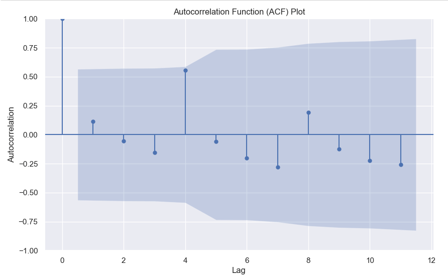
Here we can clearly see a spike at 4, indicating what we already know that there is a seasonality present within the time series data.
3. Decomposition –
Decomposition is a technique used to break down a time series into its individual components: trend, seasonality, and residual (also known as error or noise). The decomposition process allows us to isolate and analyze these components separately, providing insights into the underlying patterns and variations within the time series data.
There are two commonly used types of decomposition:
Y(t) = Trend(t) + Seasonality(t) + Residual(t)Y(t) = Trend(t) * Seasonality(t) * Residual(t)Again we will be using the statsmodels package to perform seasonal decomposition.
from statsmodels.tsa.seasonal import seasonal_decompose

# Create a pandas Series with a quarterly frequency
index = pd.date_range(start='2018-01-01', periods=len(sales), freq='Q')
series = pd.Series(sales, index=index)

# Perform seasonal decomposition
decomposition = seasonal_decompose(series, model='additive')

# Extract the components
trend = decomposition.trend
seasonality = decomposition.seasonal
residuals = decomposition.resid

# Plot the components
plt.figure(figsize=(10, 8))
plt.subplot(411)
plt.plot(series, label='Original')
plt.legend(loc='best')
plt.subplot(412)
plt.plot(trend, label='Trend')
plt.legend(loc='best')
plt.subplot(413)
plt.plot(seasonality, label='Seasonality')
plt.legend(loc='best')
plt.subplot(414)
plt.plot(residuals, label='Residuals')
plt.legend(loc='best')
plt.tight_layout()
plt.show()

In this dummy example, we can clearly see via this decomposition that there is an upwards trend in the data along with a quarterly seasonality.
There are a couple more tests left to explore, but we will pick those up in the next part where we will continue to explore this seasonality and trends in time series data.
We all know about Pearson correlation among numerical variables. But what if your target is binary and you want to calculate the correlation between numerical features and binary target. Well, you can do so using point-biserial correlation.
The point-biserial correlation coefficient is a statistical measure that quantifies the relationship between a continuous variable and a dichotomous (binary) variable. It is an extension of the Pearson correlation coefficient, which measures the linear relationship between two continuous variables.
The point-biserial correlation coefficient is specifically designed to assess the relationship between a continuous variable and a binary variable that represents two categories or states. It is often used when one variable is naturally dichotomous (e.g., pass/fail, yes/no) and the other variable is continuous (e.g., test scores, age).
The coefficient ranges between -1 and +1, similar to the Pearson correlation coefficient. A value of +1 indicates a perfect positive relationship, -1 indicates a perfect negative relationship, and 0 indicates no relationship.
The calculation of the point-biserial correlation coefficient involves comparing the means of the continuous variable for each category of the binary variable and considering the variability within each category. The formula for calculating the point-biserial correlation coefficient is:
Here
 is the standard deviation of the entire population if available.
You can also easily calculate this in Python using the scipy library.
import scipy.stats as stats

# Calculate the point-biserial correlation coefficient
r_pb, p_value = stats.pointbiserialr(continuous_variable, binary_variable)
Let me know in the comments in case you’ve any questions regarding the point-biserial correlation.
Catboost offers a multitude of evaluation metrics. You can read all about them here, but often you want to use a custom evaluation metric.
For example in this ongoing Kaggle competition, the evaluation metric is Balanced Log Loss. Such a metric is not supported by catboost. By this I mean that you can’t simply write this and expect it to work.
from catboost import CatBoostClassifier
model = CatBoostClassifier(eval_metric="BalancedLogLoss")
model.fit(X,y)
This will give you an error. What you need to define is a custom eval metric class. The template for which is pretty simple.
class UserDefinedMetric(object):
    def is_max_optimal(self):
        # Returns whether great values of metric are better
        pass

    def evaluate(self, approxes, target, weight):
        # approxes is a list of indexed containers
        # (containers with only __len__ and __getitem__ defined),
        # one container per approx dimension.
        # Each container contains floats.
        # weight is a one dimensional indexed container.
        # target is a one dimensional indexed container.

        # weight parameter can be None.
        # Returns pair (error, weights sum)
        pass

    def get_final_error(self, error, weight):
        # Returns final value of metric based on error and weight
        pass
Here there are three parts to the class.
approxes[0] as the output. Below you will find the code for Balanced Log Loss as an eval metric.
class BalancedLogLoss:
    def get_final_error(self, error, weight):
        return error

    def is_max_optimal(self):
        return False

    def evaluate(self, approxes, target, weight):
        y_true = target.astype(int)
        y_pred = approxes[0].astype(float)

        y_pred = np.clip(y_pred, 1e-15, 1 - 1e-15)
        individual_loss = -(y_true * np.log(y_pred) + (1 - y_true) * np.log(1 - y_pred))

        class_weights = np.where(y_true == 1, np.sum(y_true == 0) / np.sum(y_true == 1), np.sum(y_true == 1) / np.sum(y_true == 0))
        weighted_loss = individual_loss * class_weights

        balanced_logloss = np.mean(weighted_loss)

        return balanced_logloss, 0.0
Then you can simply call this in your grid search or randomised search like this –model = CatBoostClassifier(verbose = False,eval_metric=BalancedLogLoss())
Write in the comments below if you’ve any questions related to custom eval metrics in Catboost or any ML framework.
We all know that to find the maximum value index we can use argmax, but what if you want to find the top 3 or top 5 values. Then you can use argpartition.
Let’s take an example array.
x = [10,1,6,8,2,12,20,15,56,23]In this array, it’s very easy to find the maximum value index, it’s 8.
But what if you want the top 3 or top 5, then you can use np.argmax.
How it works is that it first sorts the array and then partitions the array on the kth element. All elements lower than the kth element will be behind it and larger ones will be after it.
Let’s see with a few examples.
idx = np.argpartition(x, kth=-3)
print(idx)
>>> [1 4 2 3 0 5 7 6 8 9]
print([x[i] for i in idx ])
>>> [1, 2, 6, 8, 10, 12, 15, 20, 56, 23]
Here you can see that you get the top 3 indices as the last 3 values of the list, you can simply filter the values you can want by using idx[-3:].
Similarly for the top 5 –
idx = np.argpartition(x, kth=-5)
print(idx[-5:])
>>> [5 7 6 8 9]
Hopefully, this post explains how you can use arg-partition to get the top k element indices. If you have any questions, feel free to ask in the comments or here on my Youtube Channel.
KNN (K-Nearest Neighbours) is a supervised learning algorithm which uses the nearest neighbours to classify a new data point.
The tricky part is selecting the optimal k for the model.
sklearn.neighbors.KNeighborsClassifier(n_neighbors=5, *, weights='uniform', algorithm='auto', leaf_size=30, p=2, metric='minkowski', metric_params=None, n_jobs=None)
As you can see the weights by default is uniform and the n_neighbours is by default 5. Large values of k smooth things, but a very small value of k will be unreliable and could be affected by outliers.
You can pick the optimal value of the k by tuning the hyperparameter using GridSearchCV.
Then there is the value of p, which is by 2, meaning that it uses the euclidean distance, you can set it to 1 to use Manhattan distance. This is the distance it uses to chose the nearest points for classification.
Let’s code this in python-
from sklearn.neighbors import KNeighborsClassifier
from sklearn.datasets import load_iris
from sklearn.model_selection import GridSearchCV

X, y = load_iris()['data'], load_iris()['target']

#defining the search grid
param_grid = {'n_neighbors': np.arange(3,10,1),
             'p': [1,2,3]}

grid_search = GridSearchCV(estimator=KNeighborsClassifier(), param_grid=param_grid, scoring='accuracy', cv = 3)

grid_search.fit(X,y)

print(grid_search.best_params_)
>>> {'n_neighbors': 4, 'p': 2}
print(grid_search.best_score_)
>>>0.9866666666666667
Hope this post cleared how you can use KNN in your machine learning problems, and if you want me to write about any ML topic, just drop a comment below.


