While doing time series forecasting it is very important to analyse if your data has some trends, seasonality or periodicity in it. To identify if a time series has seasonality there are several techniques you can use.
We will be using the following dummy data to see how we can test for seasonal trends in our data.
sales = np.array([100, 120, 130, 150, 110, 130, 140, 160, 120, 140, 150, 170])

quarters = ['Q1 2018', 'Q2 2018', 'Q3 2018', 'Q4 2018',
            'Q1 2019', 'Q2 2019', 'Q3 2019', 'Q4 2019',
            'Q1 2020', 'Q2 2020', 'Q3 2020', 'Q4 2020']
- Visual inspection – Just by looking at the plot of the time series, you can identify that there are visible patterns in it.

In the image above you can clearly see that the sales grow from Q1 to Q3 and then decline in Q4 year on year.
2. Autocorrelation Function (ACF) – Autocorrelation refers to the correlation of a series with itself at different time lags. In other words, it quantifies the similarity or relationship between a data point and its preceding or lagged observations. The ACF helps identify any repeating patterns or dependencies within the time series data.
In the ACF plot, if we see spikes at regular lag intervals, it indicates seasonality. We can take the help of plot_acf from the statsmodels package.
import numpy as np
import pandas as pd
import matplotlib.pyplot as plt
import statsmodels.api as sm
from statsmodels.graphics.tsaplots import plot_acf

# Generate ACF plot
fig, ax = plt.subplots(figsize=(10, 6))
plot_acf(sales, lags=11, ax=ax)  # Set lags to the number of quarters (12) minus 1

plt.title('Autocorrelation Function (ACF) Plot')
plt.xlabel('Lag')
plt.ylabel('Autocorrelation')
plt.show()
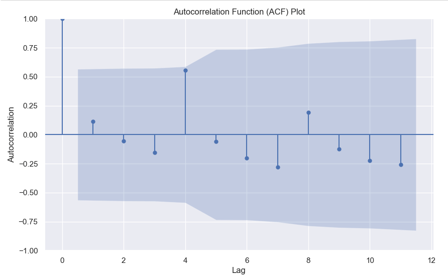
Here we can clearly see a spike at 4, indicating what we already know that there is a seasonality present within the time series data.
3. Decomposition –
Decomposition is a technique used to break down a time series into its individual components: trend, seasonality, and residual (also known as error or noise). The decomposition process allows us to isolate and analyze these components separately, providing insights into the underlying patterns and variations within the time series data.
There are two commonly used types of decomposition:
- Additive
- Multiplicative.
- Additive Decomposition: In additive decomposition, the time series is assumed to be the sum of its components. It is expressed as:
Y(t) = Trend(t) + Seasonality(t) + Residual(t)
The additive decomposition assumes that the magnitude of the seasonal fluctuations remains constant throughout the time series. - Multiplicative Decomposition: In multiplicative decomposition, the time series is assumed to be the product of its components. It is expressed as:
Y(t) = Trend(t) * Seasonality(t) * Residual(t)
Multiplicative decomposition assumes that the seasonal fluctuations grow or shrink proportionally with the trend.
Again we will be using the statsmodels package to perform seasonal decomposition.
from statsmodels.tsa.seasonal import seasonal_decompose

# Create a pandas Series with a quarterly frequency
index = pd.date_range(start='2018-01-01', periods=len(sales), freq='Q')
series = pd.Series(sales, index=index)

# Perform seasonal decomposition
decomposition = seasonal_decompose(series, model='additive')

# Extract the components
trend = decomposition.trend
seasonality = decomposition.seasonal
residuals = decomposition.resid

# Plot the components
plt.figure(figsize=(10, 8))
plt.subplot(411)
plt.plot(series, label='Original')
plt.legend(loc='best')
plt.subplot(412)
plt.plot(trend, label='Trend')
plt.legend(loc='best')
plt.subplot(413)
plt.plot(seasonality, label='Seasonality')
plt.legend(loc='best')
plt.subplot(414)
plt.plot(residuals, label='Residuals')
plt.legend(loc='best')
plt.tight_layout()
plt.show()

In this dummy example, we can clearly see via this decomposition that there is an upwards trend in the data along with a quarterly seasonality.
There are a couple more tests left to explore, but we will pick those up in the next part where we will continue to explore this seasonality and trends in time series data.
